> ## Documentation Index
> Fetch the complete documentation index at: https://docs.customei.com/llms.txt
> Use this file to discover all available pages before exploring further.
# Preview settings
> Make your artwork sit convincingly on the product, and choose how previews switch on the product page.
Every preview frame has its own rendering settings: how the artwork blends into the photo, and how much it follows the shape of the surface. Get these right and a flat design starts to look printed rather than pasted on.
## Where the settings are
Click a **Design Preview** frame, with nothing on it selected, and the settings appear in the right-hand panel.
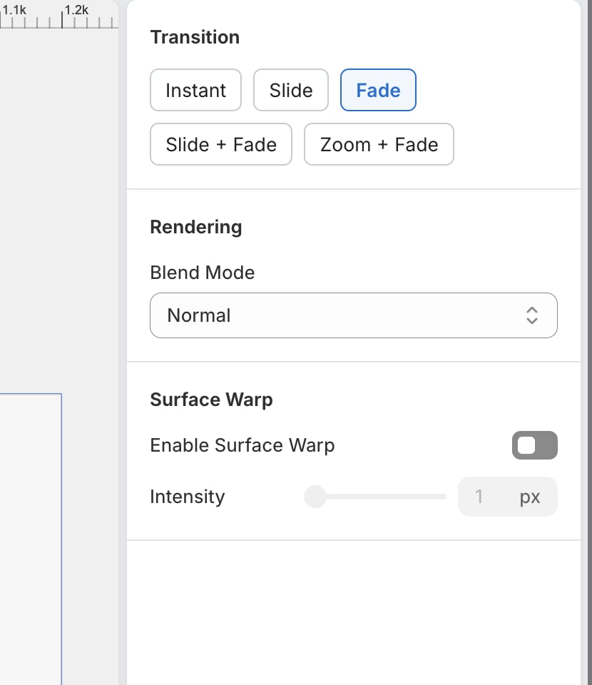 If you see layer settings instead, you have a layer selected. Click an empty part of the preview frame to get back to the frame's own settings.
**Rendering** and **Surface Warp** are saved per preview frame, so each product photo can be treated differently. **Transition** is one choice for the whole template.
## Rendering: blend mode
**Blend Mode** decides how your artwork mixes with the photo underneath.
| Mode | Use it when |
| ------------------------------------------------------------------------------ | -------------------------------------------------------------------------------------------------------------------- |
| **Normal** | The default. Your artwork sits on top, opaque, exactly as designed. |
| **Multiply** | The product has folds, shadows, or texture you want showing through the print. The workhorse for fabric and ceramic. |
| **Screen** / **Lighten** | Printing something light onto a dark product. |
| **Overlay** / **Soft Light** / **Hard Light** | You want the product's shading to affect the artwork without washing it out. |
| **Darken** / **Color Burn** / **Color Dodge** / **Difference** / **Exclusion** | Special effects. Try them, but check the result. |
Multiply is the one worth learning. On a white mug or a heather t-shirt it lets the fabric texture and the shadow in a fold come through the ink, which is what makes a preview believable.
Blend modes only affect the **preview**. They never change the file that goes to your printer, so nothing here can spoil a print.
## Surface Warp
Real products aren't flat. **Surface Warp** bends your artwork so it follows the curve of the product instead of lying across it like a sticker.
Turn on **Enable Surface Warp**, then raise **Intensity** until the artwork sits convincingly. Intensity runs from 1 to 50 pixels, which is how far the artwork is allowed to shift to follow the surface.
* A mug, a cushion, a rolled sleeve: try somewhere in the middle and adjust by eye.
* A flat canvas, a poster, a card: leave it off. There's nothing to bend around.
Nudge Intensity a little at a time and watch the preview. Too much and lettering starts to look wobbly, which reads as a printing fault to a shopper.
If a product needs more than this, such as artwork moulded onto a curved surface or hidden where it wraps out of sight, that detail belongs on the mockup itself. See [Warp and realism](/mockups/warp-and-realism).
## Transition
When your product page has several previews, **Transition** is the animation a shopper sees as they move between them.
| Transition | What the shopper sees |
| ---------------- | --------------------------------------- |
| **Instant** | The next preview appears immediately |
| **Slide** | The new preview slides in from the side |
| **Fade** | One preview dissolves into the next |
| **Slide + Fade** | Slides in while fading up |
| **Zoom + Fade** | Grows into place while fading up |
**Fade** or **Slide + Fade** suit most stores. **Instant** is the honest choice if you'd rather your product page felt fast than smooth.
## Where to next
Add more product photos to your template.
Mesh, displacement, and blending on the mockup itself.
Which canvas gets printed.
Put the template on a product page.
If you see layer settings instead, you have a layer selected. Click an empty part of the preview frame to get back to the frame's own settings.
**Rendering** and **Surface Warp** are saved per preview frame, so each product photo can be treated differently. **Transition** is one choice for the whole template.
## Rendering: blend mode
**Blend Mode** decides how your artwork mixes with the photo underneath.
| Mode | Use it when |
| ------------------------------------------------------------------------------ | -------------------------------------------------------------------------------------------------------------------- |
| **Normal** | The default. Your artwork sits on top, opaque, exactly as designed. |
| **Multiply** | The product has folds, shadows, or texture you want showing through the print. The workhorse for fabric and ceramic. |
| **Screen** / **Lighten** | Printing something light onto a dark product. |
| **Overlay** / **Soft Light** / **Hard Light** | You want the product's shading to affect the artwork without washing it out. |
| **Darken** / **Color Burn** / **Color Dodge** / **Difference** / **Exclusion** | Special effects. Try them, but check the result. |
Multiply is the one worth learning. On a white mug or a heather t-shirt it lets the fabric texture and the shadow in a fold come through the ink, which is what makes a preview believable.
Blend modes only affect the **preview**. They never change the file that goes to your printer, so nothing here can spoil a print.
## Surface Warp
Real products aren't flat. **Surface Warp** bends your artwork so it follows the curve of the product instead of lying across it like a sticker.
Turn on **Enable Surface Warp**, then raise **Intensity** until the artwork sits convincingly. Intensity runs from 1 to 50 pixels, which is how far the artwork is allowed to shift to follow the surface.
* A mug, a cushion, a rolled sleeve: try somewhere in the middle and adjust by eye.
* A flat canvas, a poster, a card: leave it off. There's nothing to bend around.
Nudge Intensity a little at a time and watch the preview. Too much and lettering starts to look wobbly, which reads as a printing fault to a shopper.
If a product needs more than this, such as artwork moulded onto a curved surface or hidden where it wraps out of sight, that detail belongs on the mockup itself. See [Warp and realism](/mockups/warp-and-realism).
## Transition
When your product page has several previews, **Transition** is the animation a shopper sees as they move between them.
| Transition | What the shopper sees |
| ---------------- | --------------------------------------- |
| **Instant** | The next preview appears immediately |
| **Slide** | The new preview slides in from the side |
| **Fade** | One preview dissolves into the next |
| **Slide + Fade** | Slides in while fading up |
| **Zoom + Fade** | Grows into place while fading up |
**Fade** or **Slide + Fade** suit most stores. **Instant** is the honest choice if you'd rather your product page felt fast than smooth.
## Where to next
Add more product photos to your template.
Mesh, displacement, and blending on the mockup itself.
Which canvas gets printed.
Put the template on a product page.