> ## Documentation Index
> Fetch the complete documentation index at: https://docs.customei.com/llms.txt
> Use this file to discover all available pages before exploring further.
# Text color and stroke
> Set the fill color of a text layer, add an outline, and offer customers a choice of colors.
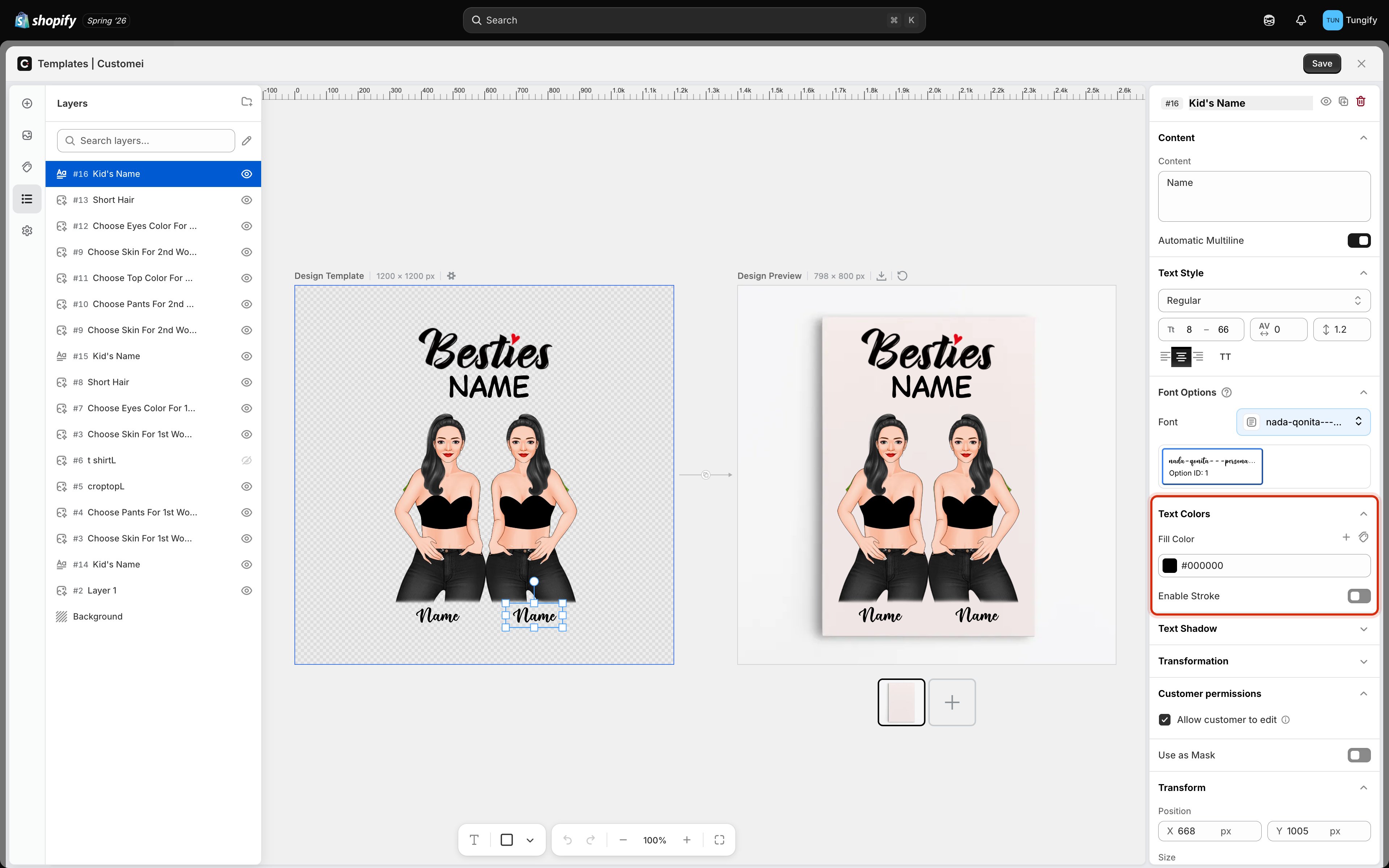
**Text Colors** controls how a text layer is colored: the fill inside the letters, and an optional outline around them.
 ## Fill color
**Fill Color** is the color of the letters themselves. Click the swatch to pick a color, or type a hex code if you are matching brand colors exactly.
## Offering a choice of colors
The **+** beside **Fill Color** adds another color to the layer. Add a few and you have a set the customer can choose from on the product page, the same way they choose a font.
The tag icon next to it attaches a **color library** instead. A library is a named set of colors kept in your Assets, which is the better option when the same palette appears across many templates. Change a color in the library and every template using it follows.
Each color gets an **Option ID**. That number is what links a color to a customer's choice in your option set: value `1` picks the first color, value `2` the second. See [Connect an option set to a template](/optionsets/connect-to-a-template).
The color shown in the picker is the one used for the preview and for any order where the customer does not choose, so set it to your sensible default.
## Stroke: an outline around the letters
Turn on **Enable Stroke** to draw an outline around each letter. You then set the outline's color and how thick it is.
A stroke earns its place in two situations:
* **Contrast.** Light text on a light product, or a name laid over a busy photo. A thin dark outline keeps the letters readable wherever they land.
* **Style.** Thick outlines are part of the look on varsity and cartoon lettering.
Go easy on thickness with thin or script fonts. A heavy stroke closes up the gaps inside letters like **a**, **e**, and **o**, and the name turns into a blob at print size.
## Colors that print the way they look
Screens light colors up from behind. Fabric and ceramic do not.
* **Very light text on a white product** all but vanishes in print, even though it is perfectly visible on your monitor.
* **Neon and highly saturated colors** are the usual disappointment. Screens show colors that ink cannot reproduce, so they come back duller than the preview.
* **Pure black on a dark garment** shows almost no contrast. Reach for a stroke or a lighter fill instead.
If you sell the same design on light and dark products, it is usually cleaner to keep separate templates than to find one color that works on both.
## Where to next
Drop, line, block, and 3D shadows.
Choose the typeface, or let customers choose.
Size ranges, spacing, and alignment.
Wire a color choice to this layer.
## Fill color
**Fill Color** is the color of the letters themselves. Click the swatch to pick a color, or type a hex code if you are matching brand colors exactly.
## Offering a choice of colors
The **+** beside **Fill Color** adds another color to the layer. Add a few and you have a set the customer can choose from on the product page, the same way they choose a font.
The tag icon next to it attaches a **color library** instead. A library is a named set of colors kept in your Assets, which is the better option when the same palette appears across many templates. Change a color in the library and every template using it follows.
Each color gets an **Option ID**. That number is what links a color to a customer's choice in your option set: value `1` picks the first color, value `2` the second. See [Connect an option set to a template](/optionsets/connect-to-a-template).
The color shown in the picker is the one used for the preview and for any order where the customer does not choose, so set it to your sensible default.
## Stroke: an outline around the letters
Turn on **Enable Stroke** to draw an outline around each letter. You then set the outline's color and how thick it is.
A stroke earns its place in two situations:
* **Contrast.** Light text on a light product, or a name laid over a busy photo. A thin dark outline keeps the letters readable wherever they land.
* **Style.** Thick outlines are part of the look on varsity and cartoon lettering.
Go easy on thickness with thin or script fonts. A heavy stroke closes up the gaps inside letters like **a**, **e**, and **o**, and the name turns into a blob at print size.
## Colors that print the way they look
Screens light colors up from behind. Fabric and ceramic do not.
* **Very light text on a white product** all but vanishes in print, even though it is perfectly visible on your monitor.
* **Neon and highly saturated colors** are the usual disappointment. Screens show colors that ink cannot reproduce, so they come back duller than the preview.
* **Pure black on a dark garment** shows almost no contrast. Reach for a stroke or a lighter fill instead.
If you sell the same design on light and dark products, it is usually cleaner to keep separate templates than to find one color that works on both.
## Where to next
Drop, line, block, and 3D shadows.
Choose the typeface, or let customers choose.
Size ranges, spacing, and alignment.
Wire a color choice to this layer.