> ## Documentation Index
> Fetch the complete documentation index at: https://docs.customei.com/llms.txt
> Use this file to discover all available pages before exploring further.
# Text content and style
> Set the words on a text layer and control size, spacing, and alignment so a customer's name always fits.
A text layer is where your customer's name, date, or message lands. Select one on the canvas or in the layer list and the right-hand panel fills with everything you can change about it.
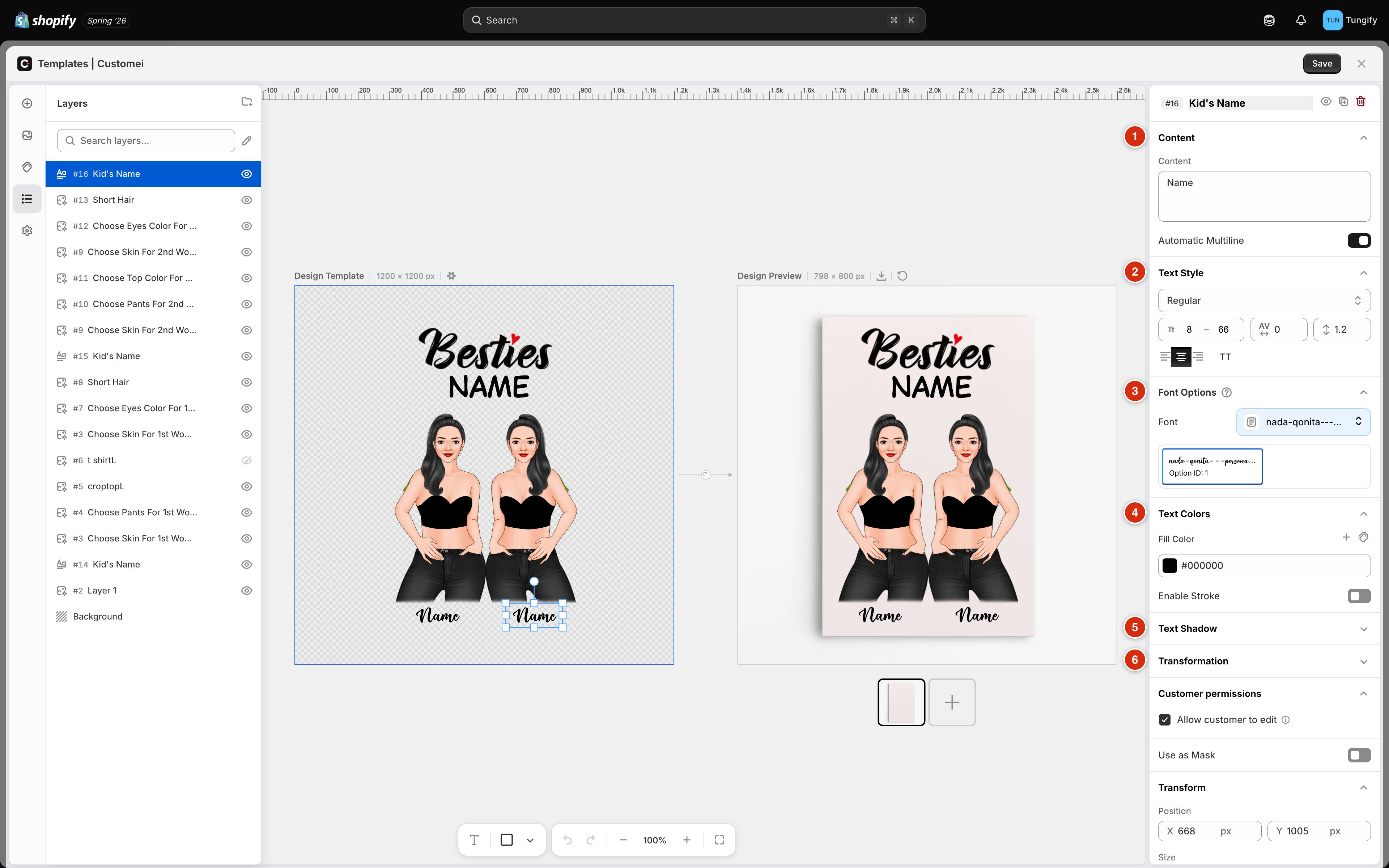 This page covers the first two sections. The rest have pages of their own, linked at the bottom.
## Content: the words on the layer
This page covers the first two sections. The rest have pages of their own, linked at the bottom.
## Content: the words on the layer
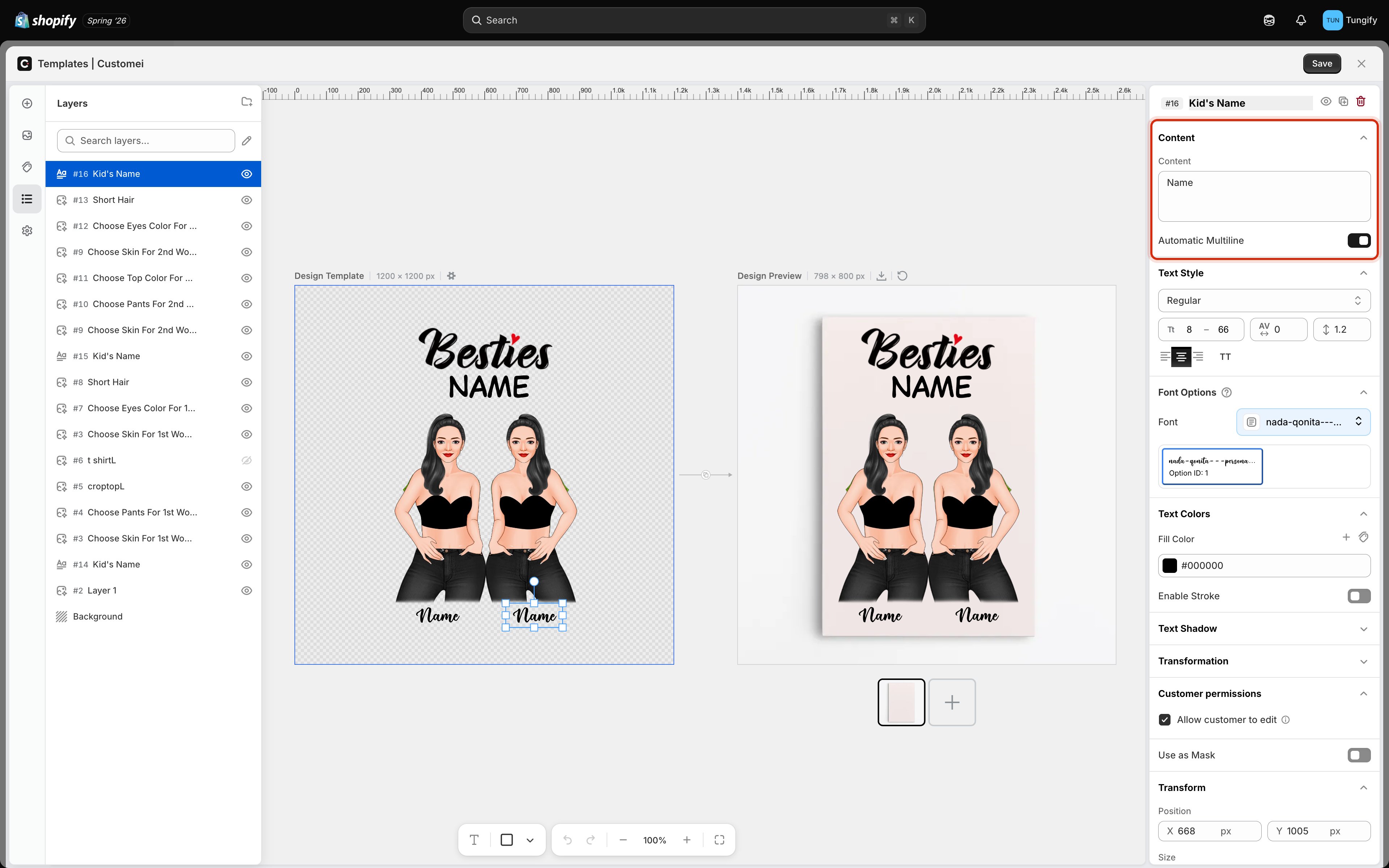 Whatever you type in **Content** is what appears on the canvas. On a personalized layer this is placeholder wording, not the finished product. It is what you and your customer see before they type anything, so write something that shows off the layer at a realistic length. "Name" or "Alexandra" tells you far more about whether the design works than "Text 1" does.
**Automatic Multiline** decides what happens when the words are wider than the box. Leave it on and long text wraps onto a second line. Turn it off and the text stays on one line.
Type your longest realistic name into **Content** and check it still looks right. A layer that suits "Amy" can fall apart on "Konstantinos".
**Automatic Multiline** only appears on flat text. Curved and warped text follows its shape instead of wrapping, so the setting is hidden there.
## Text Style: size, spacing, and alignment
Whatever you type in **Content** is what appears on the canvas. On a personalized layer this is placeholder wording, not the finished product. It is what you and your customer see before they type anything, so write something that shows off the layer at a realistic length. "Name" or "Alexandra" tells you far more about whether the design works than "Text 1" does.
**Automatic Multiline** decides what happens when the words are wider than the box. Leave it on and long text wraps onto a second line. Turn it off and the text stays on one line.
Type your longest realistic name into **Content** and check it still looks right. A layer that suits "Amy" can fall apart on "Konstantinos".
**Automatic Multiline** only appears on flat text. Curved and warped text follows its shape instead of wrapping, so the setting is hidden there.
## Text Style: size, spacing, and alignment
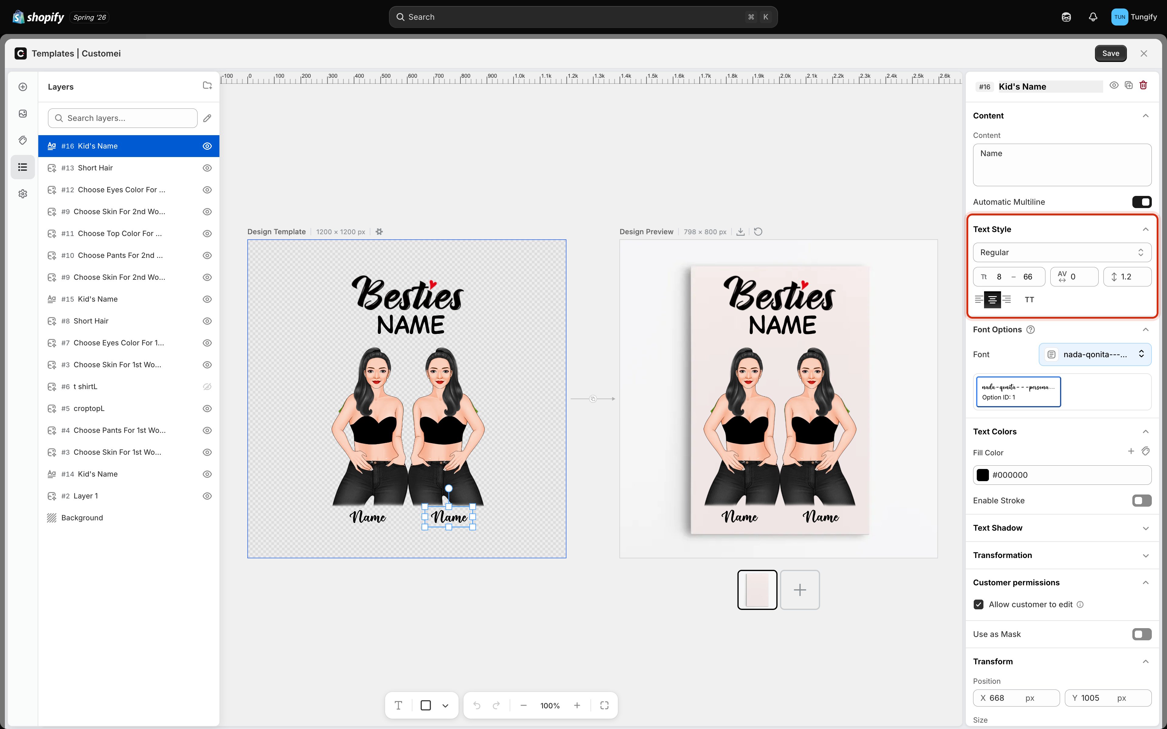 | Control | What it does |
| -------------------------- | --------------------------------------------------------------------------------------------- |
| **Regular** (the dropdown) | The weight and slant of the font: regular, bold, italic, and whatever else the font provides. |
| **Tt 8 – 66** | The smallest and largest size the text is allowed to be, in points. See below. |
| **AV 0** | Letter spacing. Raise it to open the letters out, lower it to tighten them up. |
| **↕ 1.2** | Line height, the gap between lines when text wraps onto more than one line. |
| The three bar icons | Align the text left, center, or right inside its box. |
| **TT** | Force the text to uppercase, whatever the customer types. |
### The size range is what keeps long names fitting
The two numbers under the weight dropdown are a range, not a single size. The text grows and shrinks between them so it keeps filling its box without spilling out.
* The **first number** is the floor. Text will not shrink below it, no matter how long the name is.
* The **second number** is the ceiling. Text will not grow past it, no matter how short.
This is what stops a one-letter name from ballooning and a fifteen-letter name from running off the edge of the mug. Set the ceiling to the size the design looks best at, then lower the floor until even your longest test name still fits.
Set the floor too low and long names become unreadably small on the finished print. Type a long name into **Content** and look at the design frame at that size before you settle on a number.
### Uppercase changes what gets printed
**TT** is not just a preview. If it is on, a customer who types "alex" gets "ALEX" on the product. That is usually what you want on a bold slogan and rarely what you want on a signature-style script.
## Where to next
Pick the typeface, and let customers choose their own.
Fill color, outlines, and offering a choice of colors.
Arc, wave, circle, and the other text shapes.
Decide which layers a shopper is allowed to edit.
| Control | What it does |
| -------------------------- | --------------------------------------------------------------------------------------------- |
| **Regular** (the dropdown) | The weight and slant of the font: regular, bold, italic, and whatever else the font provides. |
| **Tt 8 – 66** | The smallest and largest size the text is allowed to be, in points. See below. |
| **AV 0** | Letter spacing. Raise it to open the letters out, lower it to tighten them up. |
| **↕ 1.2** | Line height, the gap between lines when text wraps onto more than one line. |
| The three bar icons | Align the text left, center, or right inside its box. |
| **TT** | Force the text to uppercase, whatever the customer types. |
### The size range is what keeps long names fitting
The two numbers under the weight dropdown are a range, not a single size. The text grows and shrinks between them so it keeps filling its box without spilling out.
* The **first number** is the floor. Text will not shrink below it, no matter how long the name is.
* The **second number** is the ceiling. Text will not grow past it, no matter how short.
This is what stops a one-letter name from ballooning and a fifteen-letter name from running off the edge of the mug. Set the ceiling to the size the design looks best at, then lower the floor until even your longest test name still fits.
Set the floor too low and long names become unreadably small on the finished print. Type a long name into **Content** and look at the design frame at that size before you settle on a number.
### Uppercase changes what gets printed
**TT** is not just a preview. If it is on, a customer who types "alex" gets "ALEX" on the product. That is usually what you want on a bold slogan and rarely what you want on a signature-style script.
## Where to next
Pick the typeface, and let customers choose their own.
Fill color, outlines, and offering a choice of colors.
Arc, wave, circle, and the other text shapes.
Decide which layers a shopper is allowed to edit.