> ## Documentation Index
> Fetch the complete documentation index at: https://docs.customei.com/llms.txt
> Use this file to discover all available pages before exploring further.
# Text shadow
> Add a drop, line, block, or 3D shadow to a text layer and tune its color, offset, angle, and blur.
A shadow lifts lettering off the background. Used lightly it makes a name readable over a photo. Used heavily it becomes the style itself, as on retro and varsity designs.
## Turning it on
Select a text layer, open **Text Shadow**, and switch on **Enable Shadow**. The shadow types and their controls appear underneath.
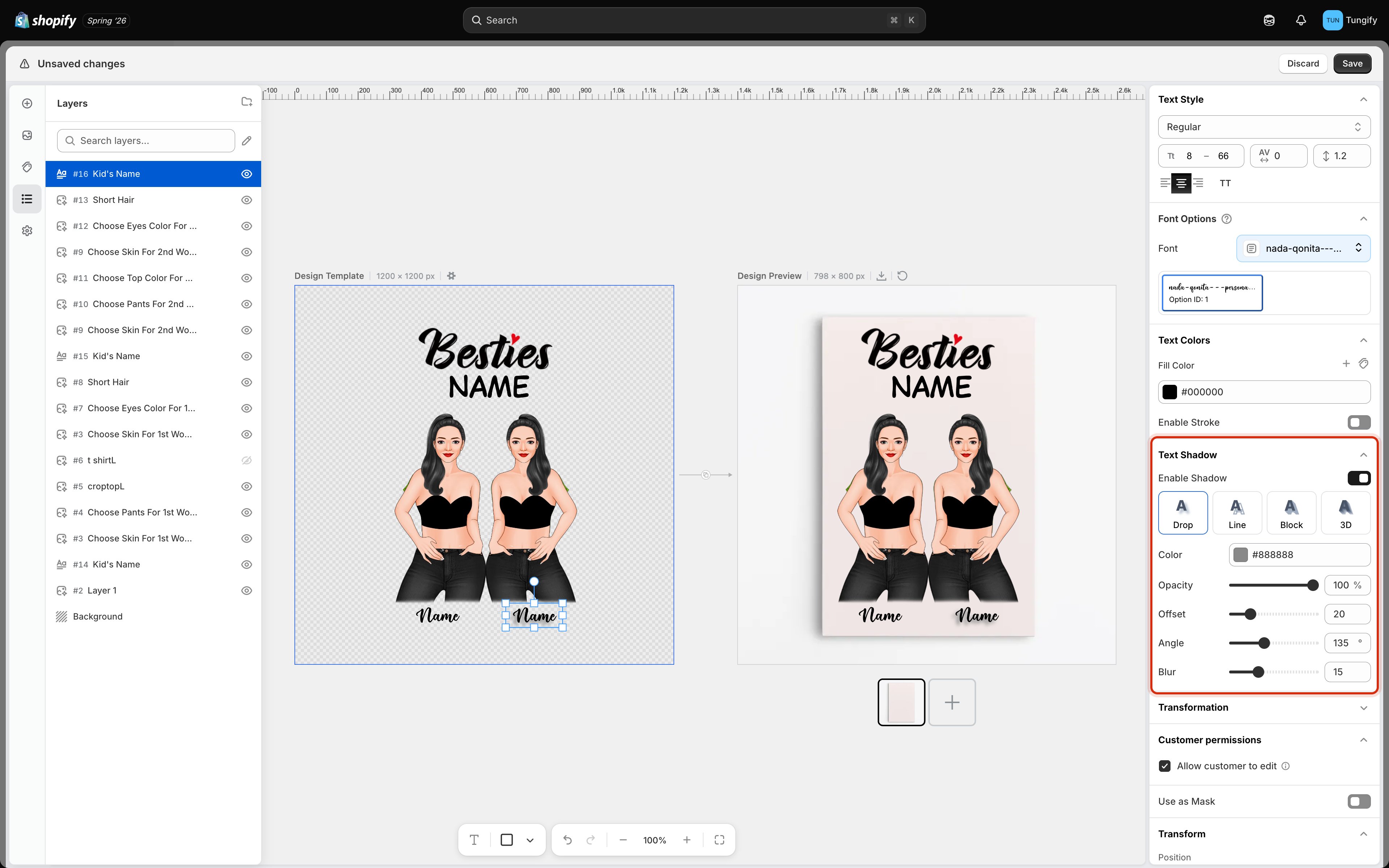 ## The four shadow types
| Type | What it looks like | Good for |
| --------- | ----------------------------------------- | ----------------------------------------------- |
| **Drop** | A soft copy of the text sitting behind it | Lifting a name off a photo or a busy background |
| **Line** | A hard outline tracing the letters | Keeping text readable without a soft blur |
| **Block** | A solid slab extending from the letters | Retro and varsity lettering |
| **3D** | The letters extruded back into depth | Bold display headlines |
Click a type to switch. The controls below change with it, because a soft drop shadow needs a blur while a hard block shadow does not.
## The controls
| Control | What it changes |
| ------------- | ------------------------------------------------------------------ |
| **Color** | The color of the shadow itself |
| **End Color** | On the shadow types that fade, the color the shadow finishes on |
| **Offset** | How far the shadow sits from the text, from 0 to 100 |
| **Angle** | Which direction it falls, all the way around from 0 to 360 degrees |
| **Blur** | How soft its edge is, from 0 to 50. Only on the types that use one |
| **Thickness** | On **Line**, how heavy the outline is |
Keep the angle the same on every layer of a design. Shadows falling in different directions on the same product read as a mistake, because in the real world there is only one light source.
## Getting a shadow that survives printing
The preview is generous. Ink is not.
* **Grey beats black.** A mid grey shadow reads as depth. A pure black one reads as a printing fault.
* **A little offset goes a long way.** Large offsets look dramatic on screen and muddy at print size, because the shadow starts competing with the letters instead of supporting them.
* **Blur is expensive on fabric.** A soft gradient that looks smooth on a poster can band or speckle when printed on a t-shirt. On garments, **Line** or **Block** is often the safer choice.
Check the shadow against your longest test name. A shadow tuned on a short word can collide with neighbouring letters once the text shrinks to fit a longer one.
## Where to next
Fill color and outlines.
Arc, wave, circle, and other text shapes.
Size ranges, spacing, and alignment.
Make the design sit convincingly on the product.
## The four shadow types
| Type | What it looks like | Good for |
| --------- | ----------------------------------------- | ----------------------------------------------- |
| **Drop** | A soft copy of the text sitting behind it | Lifting a name off a photo or a busy background |
| **Line** | A hard outline tracing the letters | Keeping text readable without a soft blur |
| **Block** | A solid slab extending from the letters | Retro and varsity lettering |
| **3D** | The letters extruded back into depth | Bold display headlines |
Click a type to switch. The controls below change with it, because a soft drop shadow needs a blur while a hard block shadow does not.
## The controls
| Control | What it changes |
| ------------- | ------------------------------------------------------------------ |
| **Color** | The color of the shadow itself |
| **End Color** | On the shadow types that fade, the color the shadow finishes on |
| **Offset** | How far the shadow sits from the text, from 0 to 100 |
| **Angle** | Which direction it falls, all the way around from 0 to 360 degrees |
| **Blur** | How soft its edge is, from 0 to 50. Only on the types that use one |
| **Thickness** | On **Line**, how heavy the outline is |
Keep the angle the same on every layer of a design. Shadows falling in different directions on the same product read as a mistake, because in the real world there is only one light source.
## Getting a shadow that survives printing
The preview is generous. Ink is not.
* **Grey beats black.** A mid grey shadow reads as depth. A pure black one reads as a printing fault.
* **A little offset goes a long way.** Large offsets look dramatic on screen and muddy at print size, because the shadow starts competing with the letters instead of supporting them.
* **Blur is expensive on fabric.** A soft gradient that looks smooth on a poster can band or speckle when printed on a t-shirt. On garments, **Line** or **Block** is often the safer choice.
Check the shadow against your longest test name. A shadow tuned on a short word can collide with neighbouring letters once the text shrinks to fit a longer one.
## Where to next
Fill color and outlines.
Arc, wave, circle, and other text shapes.
Size ranges, spacing, and alignment.
Make the design sit convincingly on the product.