> ## Documentation Index
> Fetch the complete documentation index at: https://docs.customei.com/llms.txt
> Use this file to discover all available pages before exploring further.
# Warp and realism
> Bend artwork around a curved product, let the fabric texture show through, and hide print that spills over the edge.
A print area lined up on a photo gets you a preview. These settings get you a preview a shopper believes. They all live in the sidebar of [the mockup designer](/mockups/mockup-designer), and they all apply to the **active design area**.
## Follow the shape of the product
Inside every design area is a grid. Drag its points and the artwork bends with them, so a straight design can be made to wrap a mug, sit inside a curved frame, or ride over the fold of a folded shirt.
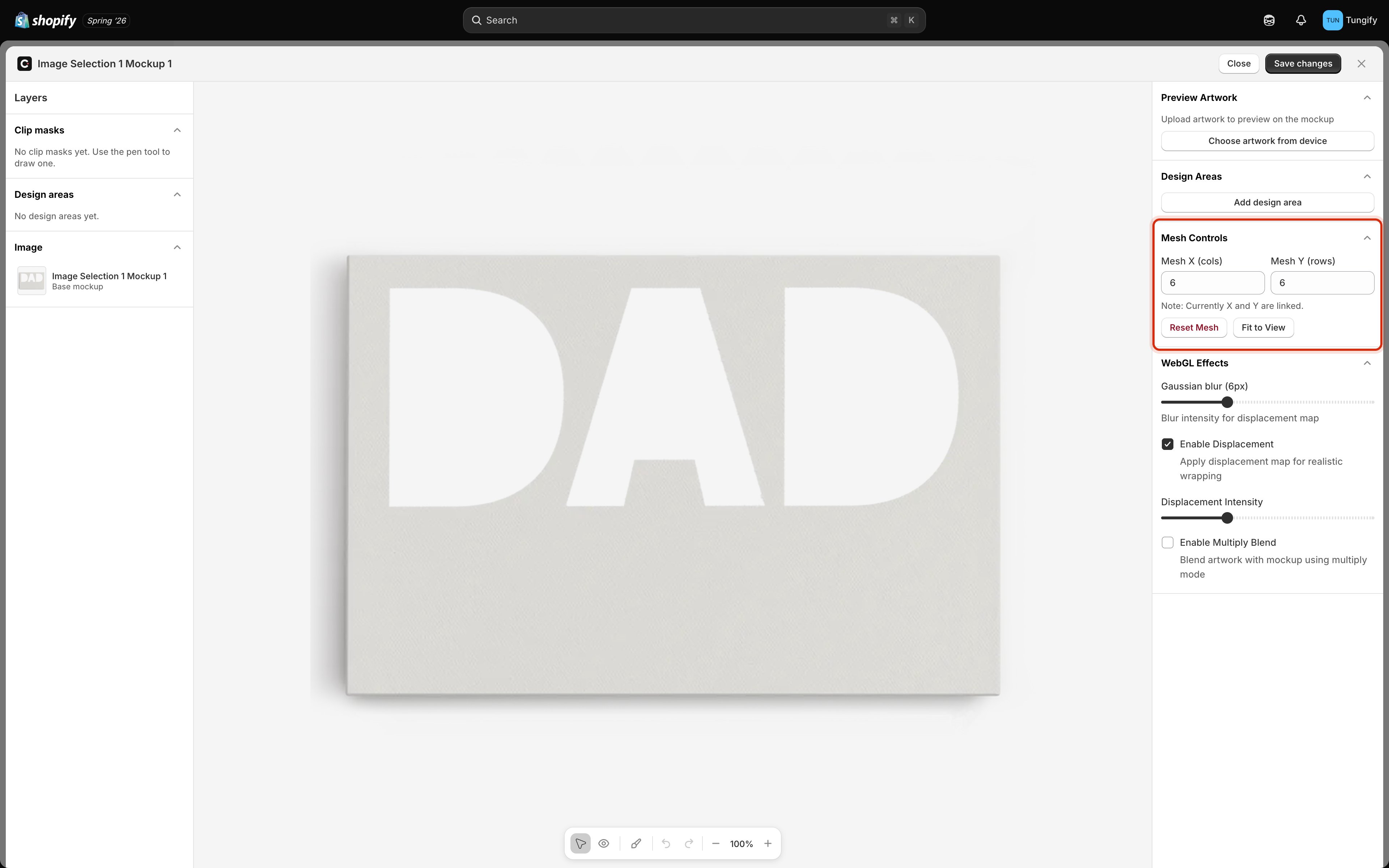 **Mesh X** and **Mesh Y** set how many divisions the grid has, from 2 to 10. More points means finer control and more dragging.
* **2–4** for a gentle bend: a wall canvas, a slightly curved frame.
* **6** is a sensible default and what you start with.
* **8–10** for a strongly curved surface: a mug, a bottle, a cushion corner.
The two numbers move together for now, so set one and the other follows.
Two buttons help while you work:
* **Reset Mesh** throws away your dragging and puts the grid back to a plain rectangle. Useful when a warp has gone wrong and you'd rather restart than untangle it.
* **Fit to View** re-centres and re-zooms the canvas so the whole mockup is on screen.
Warp in small steps and keep [a sample design](/mockups/mockup-designer#try-a-real-design-on-it) loaded while you do it. Straight lines and lettering show a bad warp instantly; a photo hides it until a customer complains.
## Let the product's texture show through
Bending the artwork gets the shape right. These two settings get the *surface* right.
**Mesh X** and **Mesh Y** set how many divisions the grid has, from 2 to 10. More points means finer control and more dragging.
* **2–4** for a gentle bend: a wall canvas, a slightly curved frame.
* **6** is a sensible default and what you start with.
* **8–10** for a strongly curved surface: a mug, a bottle, a cushion corner.
The two numbers move together for now, so set one and the other follows.
Two buttons help while you work:
* **Reset Mesh** throws away your dragging and puts the grid back to a plain rectangle. Useful when a warp has gone wrong and you'd rather restart than untangle it.
* **Fit to View** re-centres and re-zooms the canvas so the whole mockup is on screen.
Warp in small steps and keep [a sample design](/mockups/mockup-designer#try-a-real-design-on-it) loaded while you do it. Straight lines and lettering show a bad warp instantly; a photo hides it until a customer complains.
## Let the product's texture show through
Bending the artwork gets the shape right. These two settings get the *surface* right.
 ### Displacement
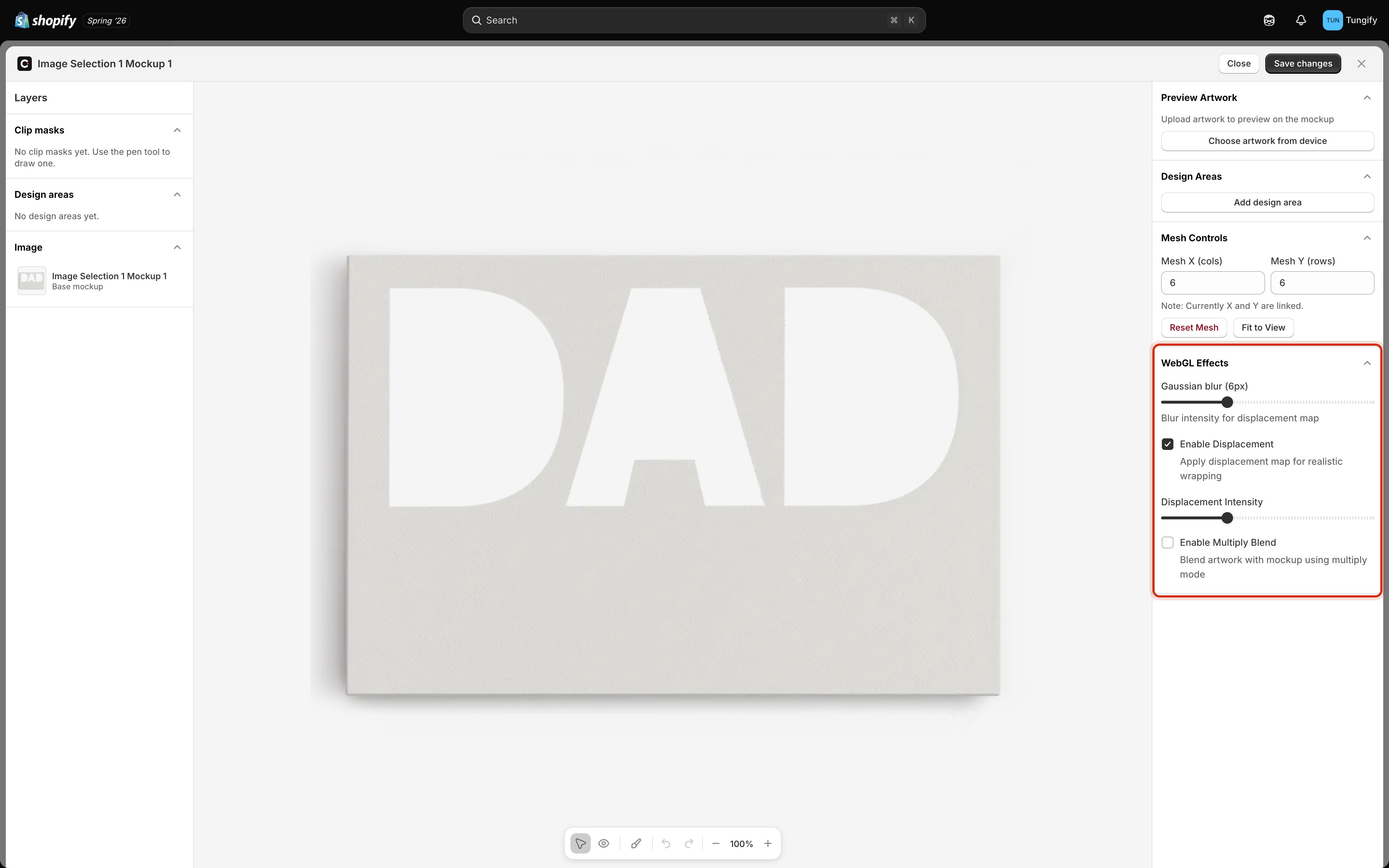
**Enable Displacement** reads the light and shade of your product photo and pushes the artwork around to match. Print laid across a wrinkle bends with the wrinkle; print on woven fabric picks up the weave. It's what stops a design looking like a sticker.
It's on by default. Two controls shape it:
| Control | What it does |
| -------------------------- | ----------------------------------------------------------------------------------------------------------------------------------------------------- |
| **Gaussian blur** | How much the photo's detail is smoothed before it's used. Low keeps every thread and pore, which can look noisy. Higher gives a softer, broader bend. |
| **Displacement Intensity** | How far the artwork is allowed to move. Raise it for deep folds and heavy texture, lower it for a smooth surface. |
Turning displacement on regenerates the effect from your photo, so the canvas takes a moment to catch up. Same when you move the blur slider.
Too much intensity breaks lettering apart. If names or dates start to look wobbly, bring it down until they read cleanly. Shoppers read a distorted name as a printing fault.
### Multiply blend
**Enable Multiply Blend** lets the shadows in the photo darken the artwork on top. A fold that's in shadow keeps its shadow, and printing on a coloured product picks up that colour rather than sitting on it like paint.
Turn it on and a **Shade Strength** slider appears, from 0 to 2, controlling how strongly the photo's shading comes through. Around 1 is faithful; above that you're deliberately exaggerating the shadows.
Use it on fabric, ceramic, and wood. Leave it off for a flat print behind glass, where there's nothing to shade.
## Hide artwork that spills over
On some products the print area reaches past the product itself: the shoulder of a shirt, the far side of a mug, the rim of a plate. Artwork sitting there needs hiding, or the preview shows print floating in mid-air.
A **clip mask** is a shape you draw to mark what stays visible.
### Displacement
**Enable Displacement** reads the light and shade of your product photo and pushes the artwork around to match. Print laid across a wrinkle bends with the wrinkle; print on woven fabric picks up the weave. It's what stops a design looking like a sticker.
It's on by default. Two controls shape it:
| Control | What it does |
| -------------------------- | ----------------------------------------------------------------------------------------------------------------------------------------------------- |
| **Gaussian blur** | How much the photo's detail is smoothed before it's used. Low keeps every thread and pore, which can look noisy. Higher gives a softer, broader bend. |
| **Displacement Intensity** | How far the artwork is allowed to move. Raise it for deep folds and heavy texture, lower it for a smooth surface. |
Turning displacement on regenerates the effect from your photo, so the canvas takes a moment to catch up. Same when you move the blur slider.
Too much intensity breaks lettering apart. If names or dates start to look wobbly, bring it down until they read cleanly. Shoppers read a distorted name as a printing fault.
### Multiply blend
**Enable Multiply Blend** lets the shadows in the photo darken the artwork on top. A fold that's in shadow keeps its shadow, and printing on a coloured product picks up that colour rather than sitting on it like paint.
Turn it on and a **Shade Strength** slider appears, from 0 to 2, controlling how strongly the photo's shading comes through. Around 1 is faithful; above that you're deliberately exaggerating the shadows.
Use it on fabric, ceramic, and wood. Leave it off for a flat print behind glass, where there's nothing to shade.
## Hide artwork that spills over
On some products the print area reaches past the product itself: the shoulder of a shirt, the far side of a mug, the rim of a plate. Artwork sitting there needs hiding, or the preview shows print floating in mid-air.
A **clip mask** is a shape you draw to mark what stays visible.
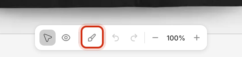 Click the brush in the bottom toolbar, or press P. A pink bar appears with the controls you need.
**Click** to drop a corner point. **Click and drag** instead, and that point becomes a curve, which is what you want along the side of a mug or the shoulder of a shirt.
**Click your first point** to finish. Backspace removes the point you just placed, and Esc abandons the shape.
Your mask appears in the **Clip masks** list on the left, and artwork outside it disappears. Load a sample design to confirm. When it looks right, click **Save changes**.
Click the brush in the bottom toolbar, or press P. A pink bar appears with the controls you need.
**Click** to drop a corner point. **Click and drag** instead, and that point becomes a curve, which is what you want along the side of a mug or the shoulder of a shirt.
**Click your first point** to finish. Backspace removes the point you just placed, and Esc abandons the shape.
Your mask appears in the **Clip masks** list on the left, and artwork outside it disappears. Load a sample design to confirm. When it looks right, click **Save changes**.
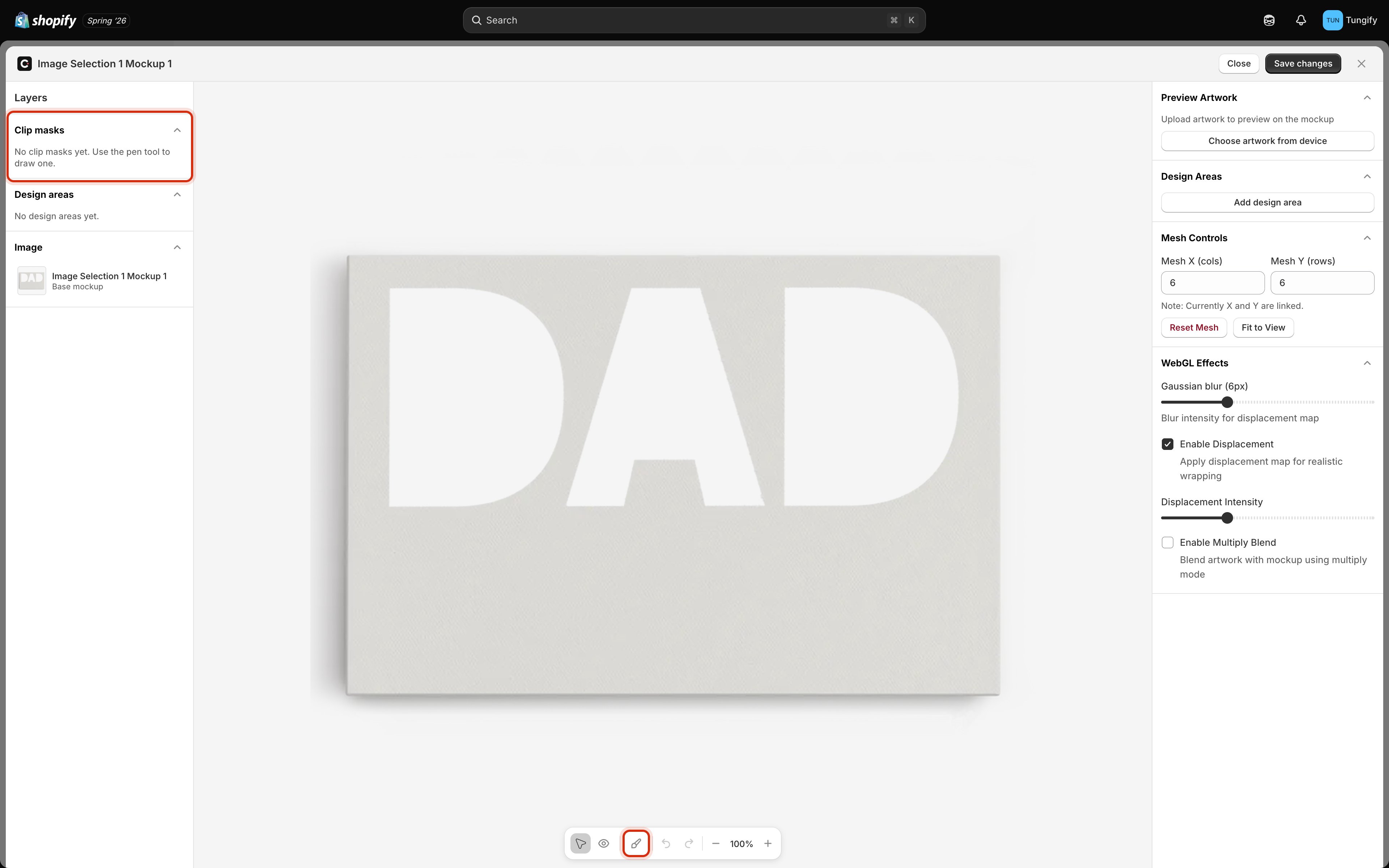 Once you have a mask, the toolbar gains buttons to delete the one you've selected or clear all of them. Draw as many as a product needs, one per region you want to keep.
Zoom in before you trace. A mask drawn at 100% looks fine until a customer's dark photo lands on a light product and every stray pixel shows.
## Where to next
Design areas and previewing a real design.
The lighter, per-frame settings in the editor.
Where mockups live and how to add them.
Use the finished mockup on a template.
Once you have a mask, the toolbar gains buttons to delete the one you've selected or clear all of them. Draw as many as a product needs, one per region you want to keep.
Zoom in before you trace. A mask drawn at 100% looks fine until a customer's dark photo lands on a light product and every stray pixel shows.
## Where to next
Design areas and previewing a real design.
The lighter, per-frame settings in the editor.
Where mockups live and how to add them.
Use the finished mockup on a template.