> ## Documentation Index
> Fetch the complete documentation index at: https://docs.customei.com/llms.txt
> Use this file to discover all available pages before exploring further.
# Build your options
> Add an option, choose its type, fill in the choices, and charge extra for the ones that cost you more.
This page covers the question side of an option set: what you ask, and how the shopper answers. Making those answers change the artwork is the [next page](/optionsets/connect-to-a-template).
## Add an option
Click **Add Option** in the header. A new option appears at the bottom of the list, ready to edit.
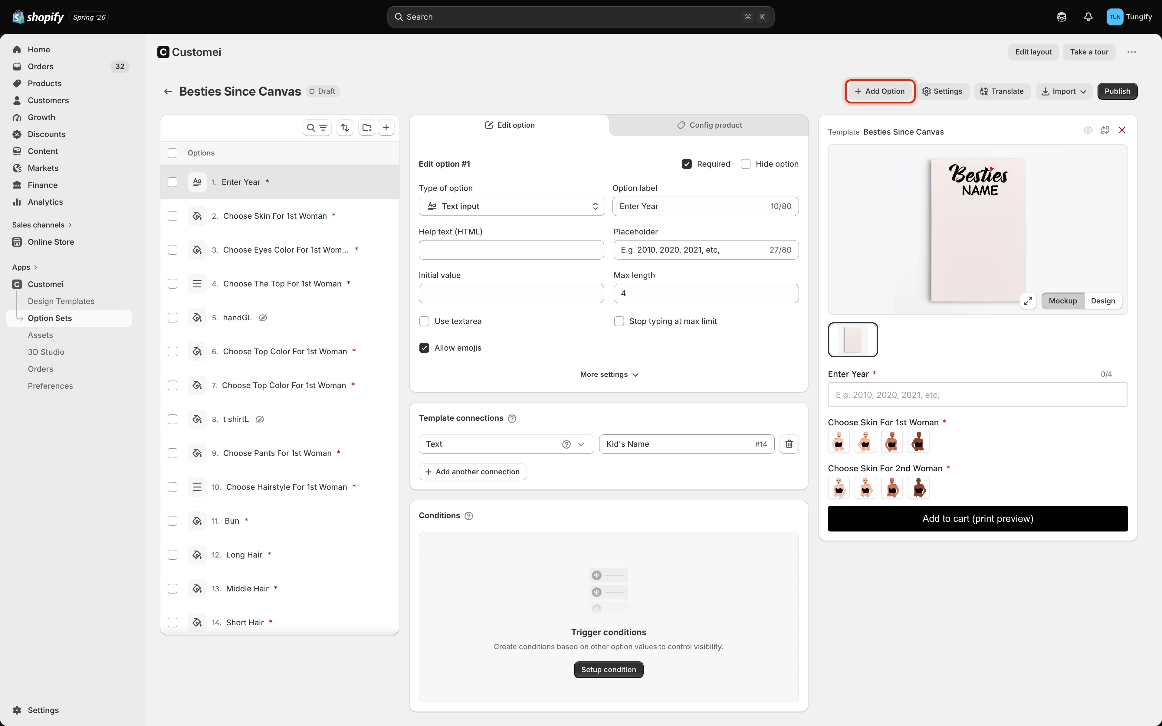 Drag options in the list to reorder them. The order in the list is the order your customer meets them, so put the choices that matter most at the top.
## Choose the type
The type decides how the shopper answers: by typing, picking, or uploading. Click **Type of option** to change it.
Drag options in the list to reorder them. The order in the list is the order your customer meets them, so put the choices that matter most at the top.
## Choose the type
The type decides how the shopper answers: by typing, picking, or uploading. Click **Type of option** to change it.
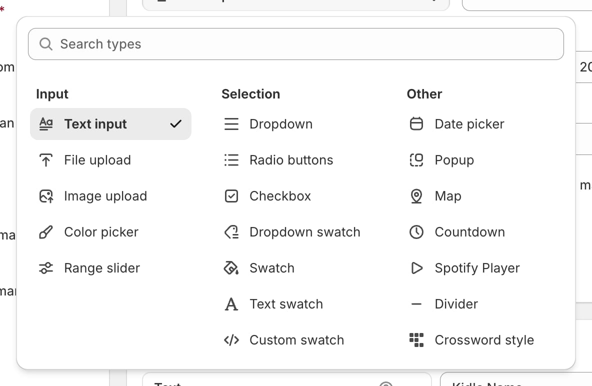 ### Input: the customer types or uploads
| Type | Use it for |
| ----------------- | ------------------------------------ |
| **Text input** | A name, a date, a short message |
| **File upload** | Any file the customer sends you |
| **Image upload** | A photo that goes onto the design |
| **Colour picker** | A free choice of colour from a wheel |
| **Range slider** | A number chosen by dragging |
### Selection: the customer picks from your list
| Type | Use it for |
| ------------------- | ------------------------------------------------- |
| **Dropdown** | A long list where space is tight |
| **Radio buttons** | A short list where every choice should be visible |
| **Checkbox** | A single yes/no add-on |
| **Swatch** | Colours or pictures shown as tappable tiles |
| **Dropdown swatch** | Swatches tucked inside a dropdown |
| **Text swatch** | Words shown as tappable tiles, like sizes |
| **Custom swatch** | Swatches you style yourself |
### Other
| Type | Use it for |
| ------------------- | ------------------------------------------------------- |
| **Date picker** | A birthday or anniversary |
| **Popup** | Extra choices in a pop-up window |
| **Map** | A place the customer searches for |
| **Countdown** | A countdown shown on the product page |
| **Spotify Player** | A track the customer links to |
| **Divider** | A visual break between groups of options |
| **Crossword style** | The look of a crossword built from the customer's words |
When in doubt, use **Radio buttons** for three or fewer choices and a **Dropdown** for more. Shoppers pick faster when they can see all the options at once.
## Fill in the settings
### Input: the customer types or uploads
| Type | Use it for |
| ----------------- | ------------------------------------ |
| **Text input** | A name, a date, a short message |
| **File upload** | Any file the customer sends you |
| **Image upload** | A photo that goes onto the design |
| **Colour picker** | A free choice of colour from a wheel |
| **Range slider** | A number chosen by dragging |
### Selection: the customer picks from your list
| Type | Use it for |
| ------------------- | ------------------------------------------------- |
| **Dropdown** | A long list where space is tight |
| **Radio buttons** | A short list where every choice should be visible |
| **Checkbox** | A single yes/no add-on |
| **Swatch** | Colours or pictures shown as tappable tiles |
| **Dropdown swatch** | Swatches tucked inside a dropdown |
| **Text swatch** | Words shown as tappable tiles, like sizes |
| **Custom swatch** | Swatches you style yourself |
### Other
| Type | Use it for |
| ------------------- | ------------------------------------------------------- |
| **Date picker** | A birthday or anniversary |
| **Popup** | Extra choices in a pop-up window |
| **Map** | A place the customer searches for |
| **Countdown** | A countdown shown on the product page |
| **Spotify Player** | A track the customer links to |
| **Divider** | A visual break between groups of options |
| **Crossword style** | The look of a crossword built from the customer's words |
When in doubt, use **Radio buttons** for three or fewer choices and a **Dropdown** for more. Shoppers pick faster when they can see all the options at once.
## Fill in the settings
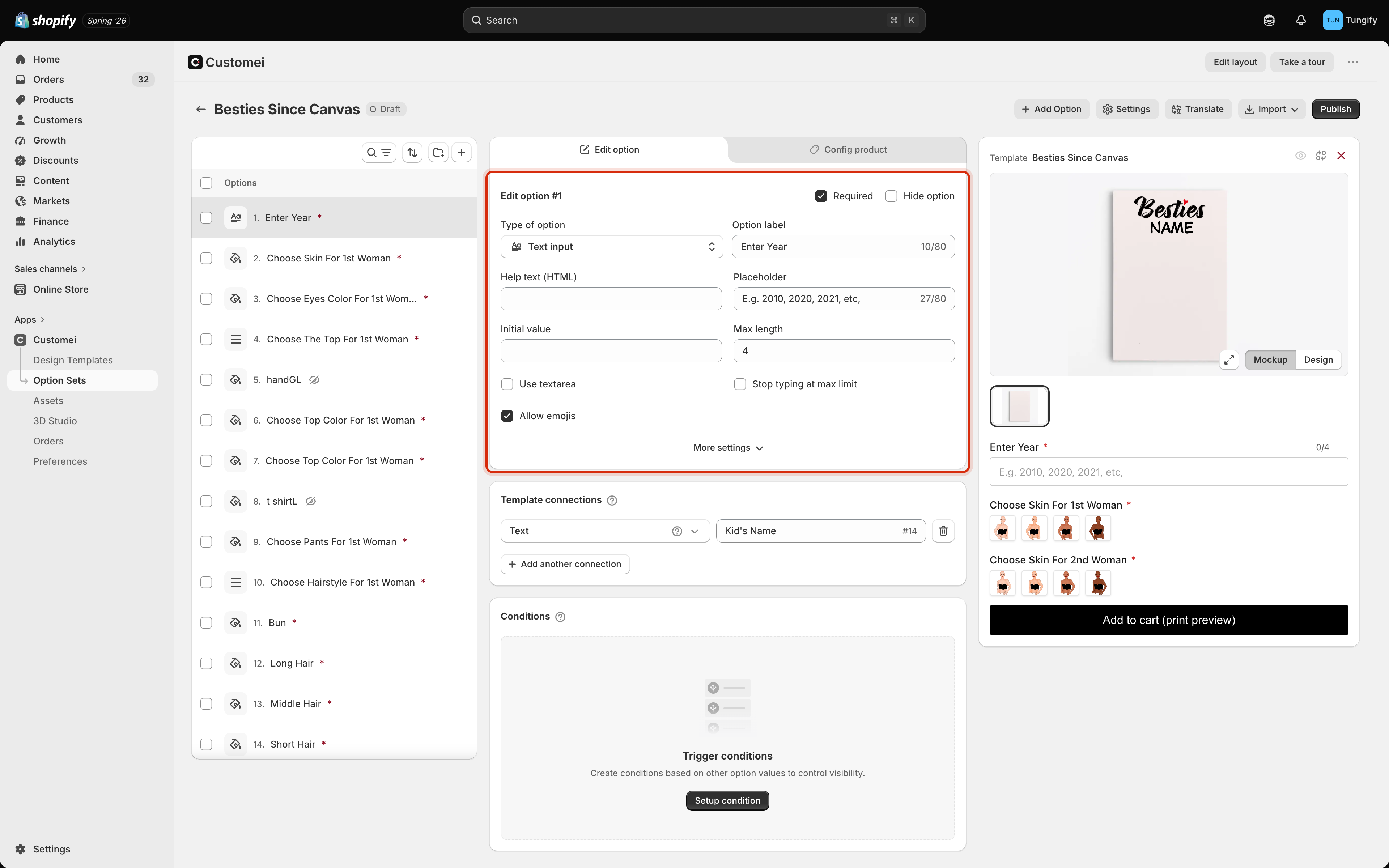 | Setting | What it does |
| ---------------------------- | ------------------------------------------------------------------------ |
| **Option label** | The wording your customer reads. Up to 80 characters. |
| **Required** | The shopper can't add to cart until they answer. |
| **Hide option** | Keeps the option in the set but out of sight on the storefront. |
| **Help text** | A line of guidance under the label. |
| **Placeholder** | Faint example text inside an empty box, such as *E.g. 2010, 2020, 2021*. |
| **Initial value** | What the box starts out containing. |
| **Max length** | How many characters the shopper can type. |
| **Use textarea** | Gives a taller box for longer messages. |
| **Stop typing at max limit** | Blocks extra characters instead of just warning. |
| **Allow emojis** | Lets emoji through. Turn it off if your font can't print them. |
| **Allow deselect** | On selection options, lets the shopper clear their choice. |
**More settings** opens the extras that only apply to the type you picked.
Set a **Max length** on any text that goes onto the artwork. A name that's twice as long as you designed for will overflow the layer, and the shopper won't know until they see the print.
## Fill in the choices
Options where the customer picks from a list have a values table underneath the settings.
| Setting | What it does |
| ---------------------------- | ------------------------------------------------------------------------ |
| **Option label** | The wording your customer reads. Up to 80 characters. |
| **Required** | The shopper can't add to cart until they answer. |
| **Hide option** | Keeps the option in the set but out of sight on the storefront. |
| **Help text** | A line of guidance under the label. |
| **Placeholder** | Faint example text inside an empty box, such as *E.g. 2010, 2020, 2021*. |
| **Initial value** | What the box starts out containing. |
| **Max length** | How many characters the shopper can type. |
| **Use textarea** | Gives a taller box for longer messages. |
| **Stop typing at max limit** | Blocks extra characters instead of just warning. |
| **Allow emojis** | Lets emoji through. Turn it off if your font can't print them. |
| **Allow deselect** | On selection options, lets the shopper clear their choice. |
**More settings** opens the extras that only apply to the type you picked.
Set a **Max length** on any text that goes onto the artwork. A name that's twice as long as you designed for will overflow the layer, and the shopper won't know until they see the print.
## Fill in the choices
Options where the customer picks from a list have a values table underneath the settings.
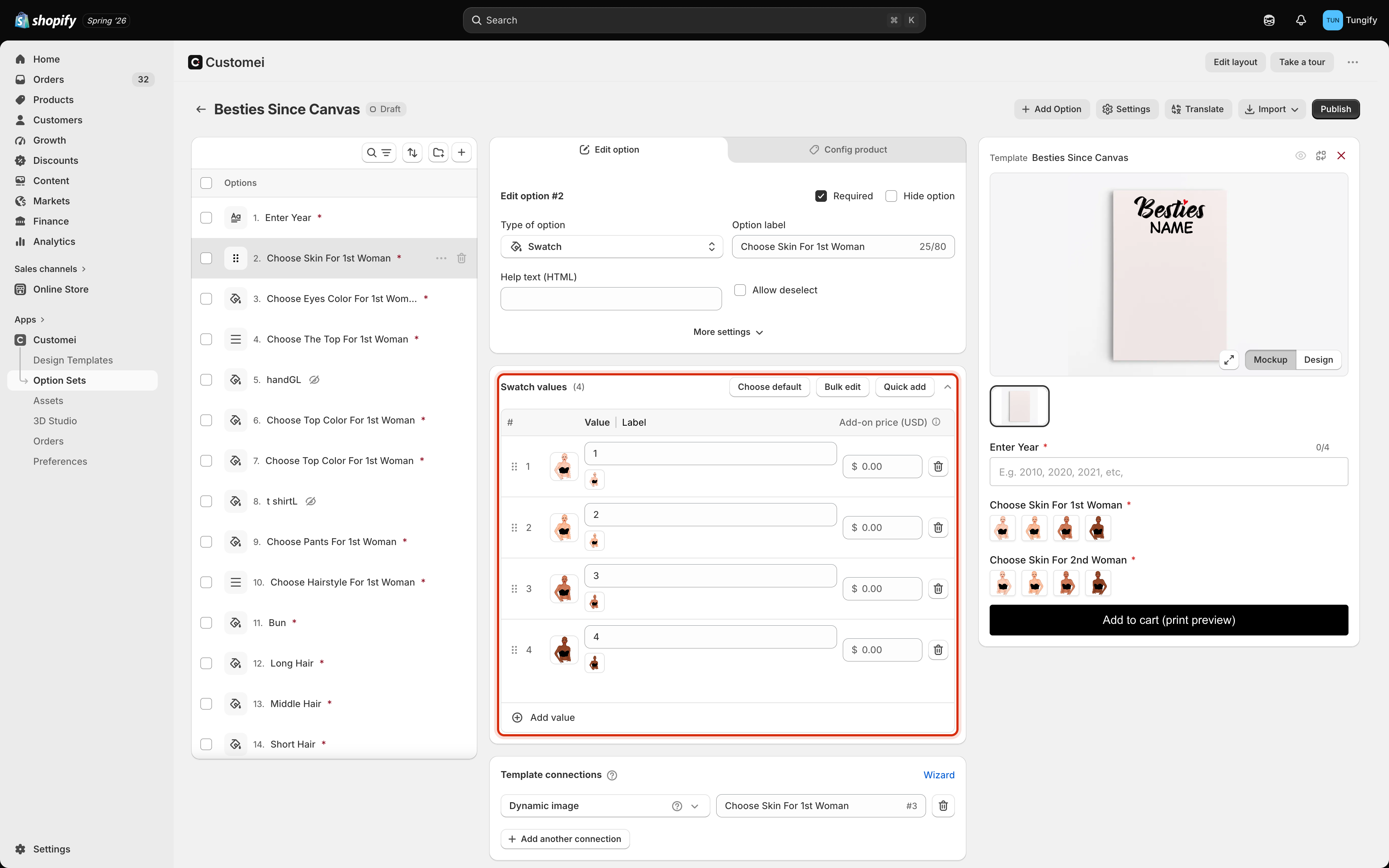 | Column | What it's for |
| ---------------------- | ------------------------------------------------------------ |
| **Value** | The internal name. This is what gets matched to your design. |
| **Label** | What the shopper reads. Leave it blank to reuse the value. |
| **Add-on price (USD)** | Extra charged when this choice is picked. |
Above the table:
* **Choose default** marks the choice a shopper starts with.
* **Bulk edit** lets you paste or edit many rows at once instead of one at a time.
* **Quick add** pulls choices in from a linked library so you don't retype them.
Drag the handle at the left of a row to reorder, and use the bin icon to remove one. **Add value** adds a row at the bottom.
## Charge extra for a choice
Put an amount in **Add-on price** and that choice adds to the product price when a shopper selects it. A `0.00` costs nothing extra.
Use it for anything that costs you more to make: a second photo, gift wrapping, a larger size.
A choice with an extra charge cannot be pre-selected as the default. If you add a price to a choice that was set as the default, Customei clears the default for you. Shopify doesn't allow a product to start out with a hidden extra cost, so your customers always opt in to paying more.
## Show an option only when it's relevant
Every option has a **Conditions** card below its connections. Use it to hide an option until the shopper has made a related choice. For example, only show *Choose Top Colour* once they've picked which top they want.
Pick **Show** or **Hide**, choose the option to watch, and set what its answer has to be. You can stack more than one rule with **Add another condition**.
Fewer visible options means a shorter, less intimidating form. Conditions are the cheapest way to keep a long option set feeling simple.
## Where to next
Make each answer change a layer on your artwork.
Put the finished option set on a product page.
| Column | What it's for |
| ---------------------- | ------------------------------------------------------------ |
| **Value** | The internal name. This is what gets matched to your design. |
| **Label** | What the shopper reads. Leave it blank to reuse the value. |
| **Add-on price (USD)** | Extra charged when this choice is picked. |
Above the table:
* **Choose default** marks the choice a shopper starts with.
* **Bulk edit** lets you paste or edit many rows at once instead of one at a time.
* **Quick add** pulls choices in from a linked library so you don't retype them.
Drag the handle at the left of a row to reorder, and use the bin icon to remove one. **Add value** adds a row at the bottom.
## Charge extra for a choice
Put an amount in **Add-on price** and that choice adds to the product price when a shopper selects it. A `0.00` costs nothing extra.
Use it for anything that costs you more to make: a second photo, gift wrapping, a larger size.
A choice with an extra charge cannot be pre-selected as the default. If you add a price to a choice that was set as the default, Customei clears the default for you. Shopify doesn't allow a product to start out with a hidden extra cost, so your customers always opt in to paying more.
## Show an option only when it's relevant
Every option has a **Conditions** card below its connections. Use it to hide an option until the shopper has made a related choice. For example, only show *Choose Top Colour* once they've picked which top they want.
Pick **Show** or **Hide**, choose the option to watch, and set what its answer has to be. You can stack more than one rule with **Add another condition**.
Fewer visible options means a shorter, less intimidating form. Conditions are the cheapest way to keep a long option set feeling simple.
## Where to next
Make each answer change a layer on your artwork.
Put the finished option set on a product page.