> ## Documentation Index
> Fetch the complete documentation index at: https://docs.customei.com/llms.txt
> Use this file to discover all available pages before exploring further.
# Custom swatches
> Start from one of 17 ready-made choice layouts, or build your own look for a set of choices.
A **Custom swatch** is a list of choices whose look you decide, instead of the tiles and dropdowns the built-in types give you. Use it for price cards, size guides, shipping options with a photo and a price, or anything that needs more than a coloured square.
You do not have to write anything. Customei ships 17 finished layouts you can drop in.
## Start from a ready-made layout
Set an option's type to **Custom swatch**, then click **Templates**.
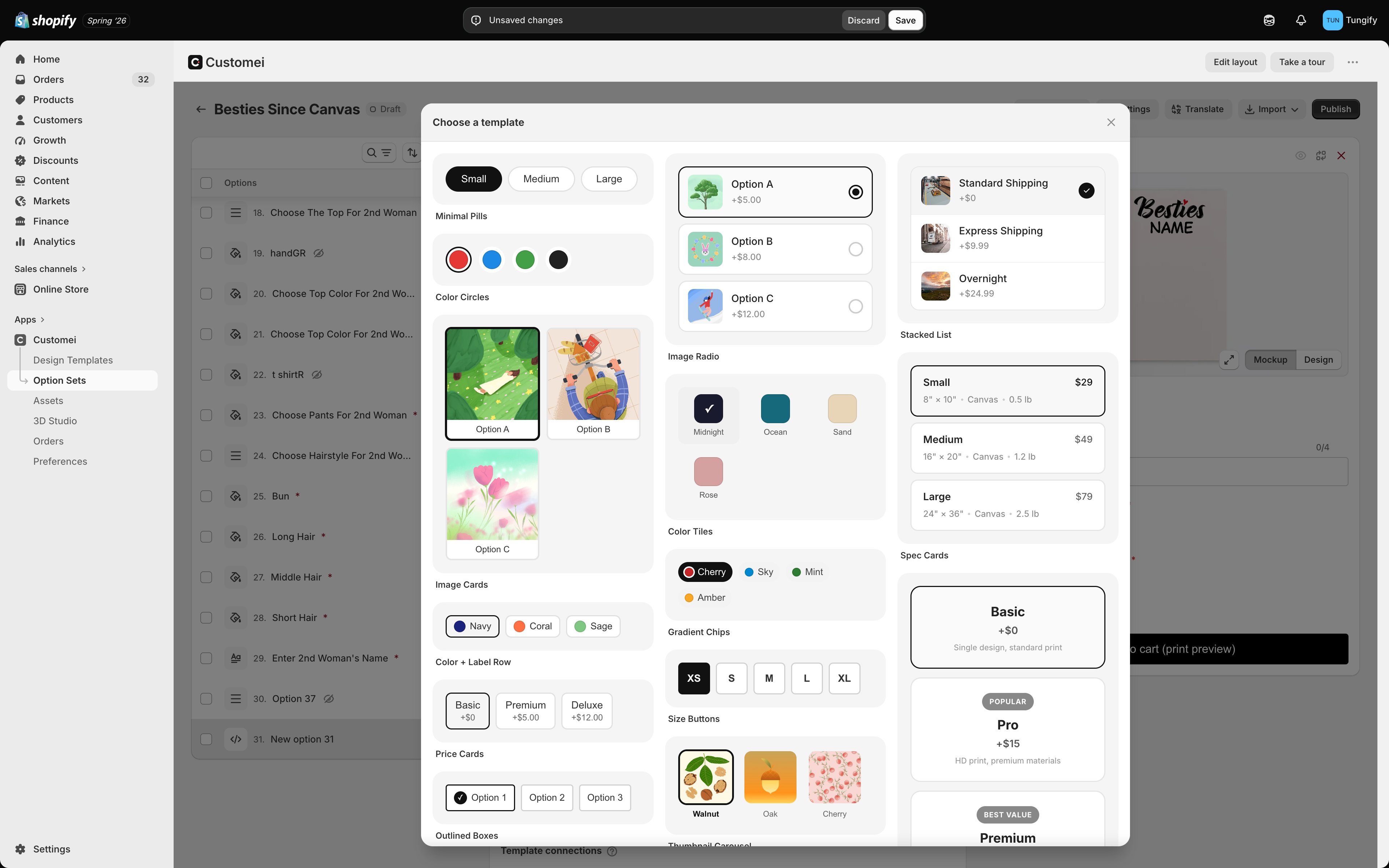 Each card in the gallery is a working preview, so what you see is what your shopper gets. Pick one and it fills in the layout for you; from there you only add your own choices in the values table underneath.
| Layout | Good for |
| -------------------------------------------------------- | --------------------------------------------------------------- |
| **Minimal Pills**, **Size Buttons**, **Badge Tags** | Sizes and other short words |
| **Colour Circles**, **Colour Tiles**, **Gradient Chips** | Colour choices |
| **Image Cards**, **Image Radio**, **Thumbnail Carousel** | Artwork or material choices that need a picture |
| **Price Cards**, **Feature Tiers**, **Spec Cards** | Upgrades where the price and what you get both matter |
| **Stacked List**, **Listing Card** | Shipping and service choices with a picture, a name and a price |
| **Size Guide** | Sizes with measurements beside them |
Pick the closest layout first and change your mind later. Swapping layout keeps your choices, so only the look changes.
## Build your own
If none of the 17 fit, the same card holds three tabs you can edit.
Each card in the gallery is a working preview, so what you see is what your shopper gets. Pick one and it fills in the layout for you; from there you only add your own choices in the values table underneath.
| Layout | Good for |
| -------------------------------------------------------- | --------------------------------------------------------------- |
| **Minimal Pills**, **Size Buttons**, **Badge Tags** | Sizes and other short words |
| **Colour Circles**, **Colour Tiles**, **Gradient Chips** | Colour choices |
| **Image Cards**, **Image Radio**, **Thumbnail Carousel** | Artwork or material choices that need a picture |
| **Price Cards**, **Feature Tiers**, **Spec Cards** | Upgrades where the price and what you get both matter |
| **Stacked List**, **Listing Card** | Shipping and service choices with a picture, a name and a price |
| **Size Guide** | Sizes with measurements beside them |
Pick the closest layout first and change your mind later. Swapping layout keeps your choices, so only the look changes.
## Build your own
If none of the 17 fit, the same card holds three tabs you can edit.
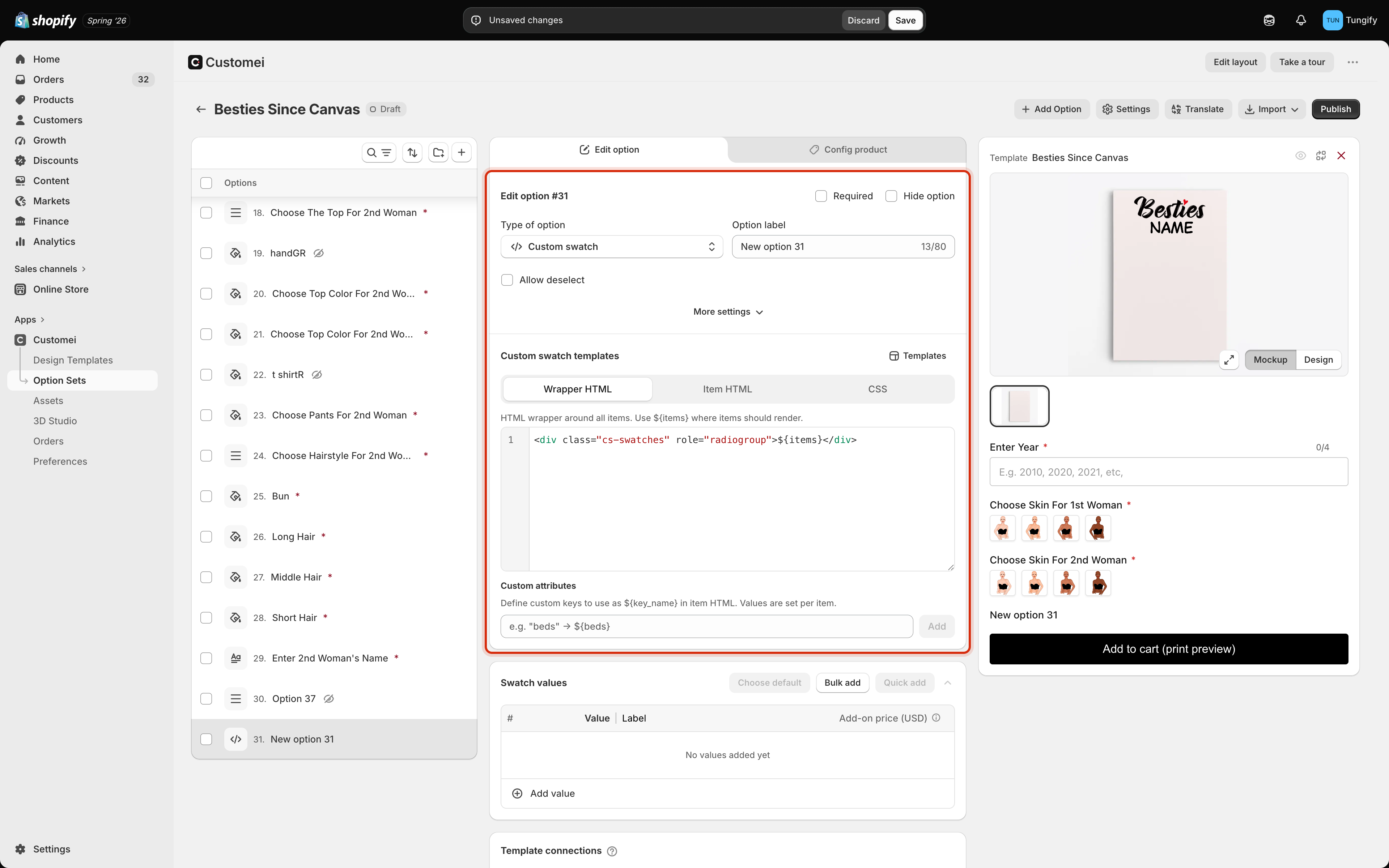 | Tab | What goes in it |
| ---------------- | --------------------------------------------------------------------------------------------------------- |
| **Wrapper HTML** | The container drawn once, around the whole set of choices. Put `${items}` where the choices should appear |
| **Item HTML** | The markup drawn once for every choice |
| **CSS** | The styling for both |
Inside **Item HTML** you can drop in what each choice knows about itself, written as `${...}`: its label, its value, its picture, its extra price.
**Custom attributes** lets you invent your own. Add a key called `beds` and every choice gets a `beds` box in the values table, which you can then place in the layout as `${beds}`. That is how the Spec Cards layout shows a size and a weight under each name.
This tab is the one place in the merchant docs where you will meet HTML and CSS. If that isn't your thing, stay with the ready-made layouts. They cover almost every case, and they were built with the same tools.
Test a custom layout on a real product page on a phone before you publish it. A layout that looks right in the preview can still be too wide on a small screen, and the preview pane is narrower than a phone.
## Adding the choices
A custom swatch fills its layout from the ordinary values table below the editor, exactly like the other swatch types: one row per choice, with a value, a label, an optional picture and an optional extra price. See [lists and swatches](/optionsets/lists-and-swatches) and [managing values](/optionsets/managing-values).
## Where to next
The built-in ways to show a set of choices.
Arrange a long form so it doesn't scare shoppers off.
| Tab | What goes in it |
| ---------------- | --------------------------------------------------------------------------------------------------------- |
| **Wrapper HTML** | The container drawn once, around the whole set of choices. Put `${items}` where the choices should appear |
| **Item HTML** | The markup drawn once for every choice |
| **CSS** | The styling for both |
Inside **Item HTML** you can drop in what each choice knows about itself, written as `${...}`: its label, its value, its picture, its extra price.
**Custom attributes** lets you invent your own. Add a key called `beds` and every choice gets a `beds` box in the values table, which you can then place in the layout as `${beds}`. That is how the Spec Cards layout shows a size and a weight under each name.
This tab is the one place in the merchant docs where you will meet HTML and CSS. If that isn't your thing, stay with the ready-made layouts. They cover almost every case, and they were built with the same tools.
Test a custom layout on a real product page on a phone before you publish it. A layout that looks right in the preview can still be too wide on a small screen, and the preview pane is narrower than a phone.
## Adding the choices
A custom swatch fills its layout from the ordinary values table below the editor, exactly like the other swatch types: one row per choice, with a value, a label, an optional picture and an optional extra price. See [lists and swatches](/optionsets/lists-and-swatches) and [managing values](/optionsets/managing-values).
## Where to next
The built-in ways to show a set of choices.
Arrange a long form so it doesn't scare shoppers off.