> ## Documentation Index
> Fetch the complete documentation index at: https://docs.customei.com/llms.txt
> Use this file to discover all available pages before exploring further.
# Popups, maps, countdowns and music
> The four option types that add something extra to a product page rather than collecting a plain answer.
Four option types do something a text box or a list can't. Two of them collect an answer in an unusual way; two of them just show something to the shopper.
| Type | Collects an answer? |
| ------------------ | ------------------------ |
| **Map** | Yes, a place |
| **Spotify Player** | Yes, a track |
| **Popup** | No, it shows information |
| **Countdown** | No, it shows a clock |
## Map
The shopper searches for a place and picks it. Use it for star maps, coordinate prints, and "where we met" gifts.
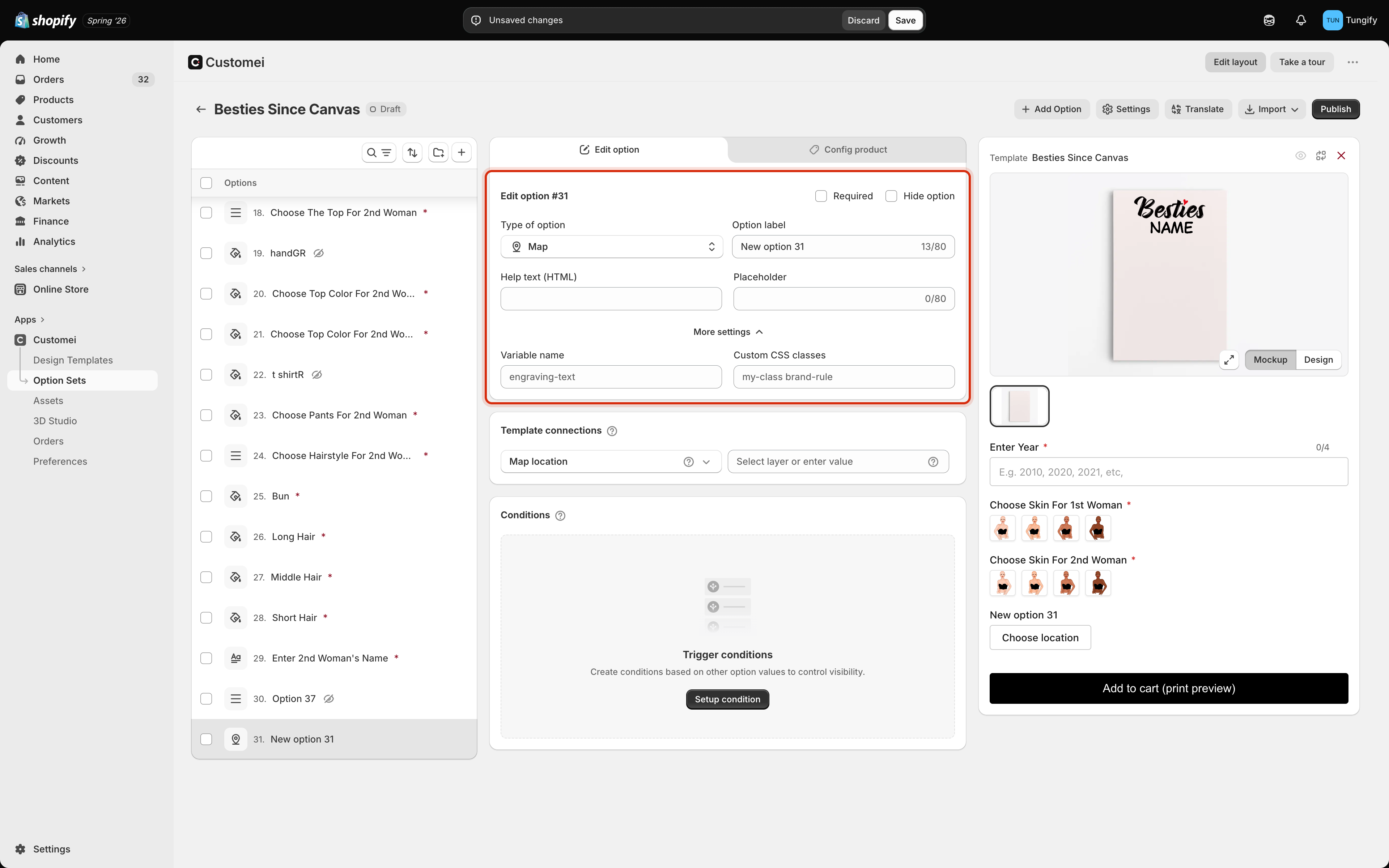 There is almost nothing to configure. A **Placeholder** to suggest what to search for is usually all it needs. Use the **Help text** to tell the shopper how precise to be, for example *the town is enough, no street needed*.
## Spotify Player
The shopper pastes a track link, and the product page shows it back to them.
There is almost nothing to configure. A **Placeholder** to suggest what to search for is usually all it needs. Use the **Help text** to tell the shopper how precise to be, for example *the town is enough, no street needed*.
## Spotify Player
The shopper pastes a track link, and the product page shows it back to them.
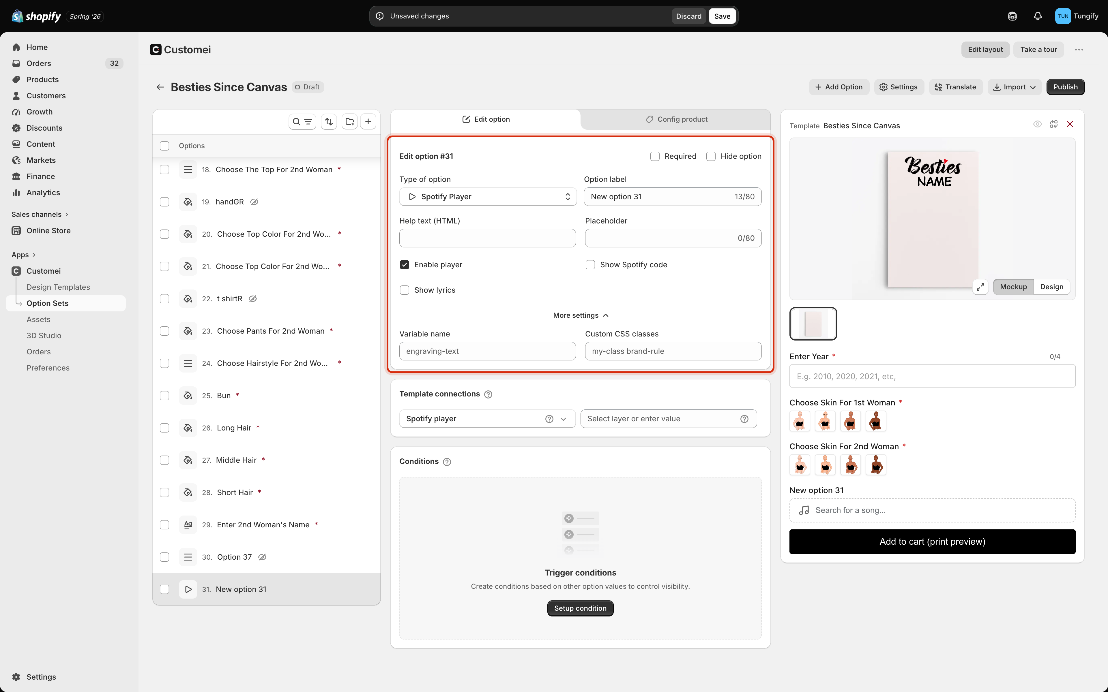 | Setting | What it does |
| --------------------- | --------------------------------------------------------------------------------- |
| **Enable player** | Shows a small player the shopper can press play on |
| **Show Spotify code** | Shows the scannable code for the track, which is usually the thing being printed |
| **Show lyrics** | Shows the words of the song |
| **Lyrics display** | With lyrics on: all of them, a set number of lines, or a set number of characters |
This option needs Spotify connected to your account first, on the [Integrations tab](/integrations/overview). Without it the shopper can paste a link but nothing comes back.
If you are printing the scannable code, keep **Show lyrics** off and **Show Spotify code** on. Fewer moving parts on the product page, and the shopper sees exactly what they will get.
## Popup
A button that opens a window of your own words. Use it for a size guide, a care instruction, or the small print about turnaround times.
| Setting | What it does |
| --------------------- | --------------------------------------------------------------------------------- |
| **Enable player** | Shows a small player the shopper can press play on |
| **Show Spotify code** | Shows the scannable code for the track, which is usually the thing being printed |
| **Show lyrics** | Shows the words of the song |
| **Lyrics display** | With lyrics on: all of them, a set number of lines, or a set number of characters |
This option needs Spotify connected to your account first, on the [Integrations tab](/integrations/overview). Without it the shopper can paste a link but nothing comes back.
If you are printing the scannable code, keep **Show lyrics** off and **Show Spotify code** on. Fewer moving parts on the product page, and the shopper sees exactly what they will get.
## Popup
A button that opens a window of your own words. Use it for a size guide, a care instruction, or the small print about turnaround times.
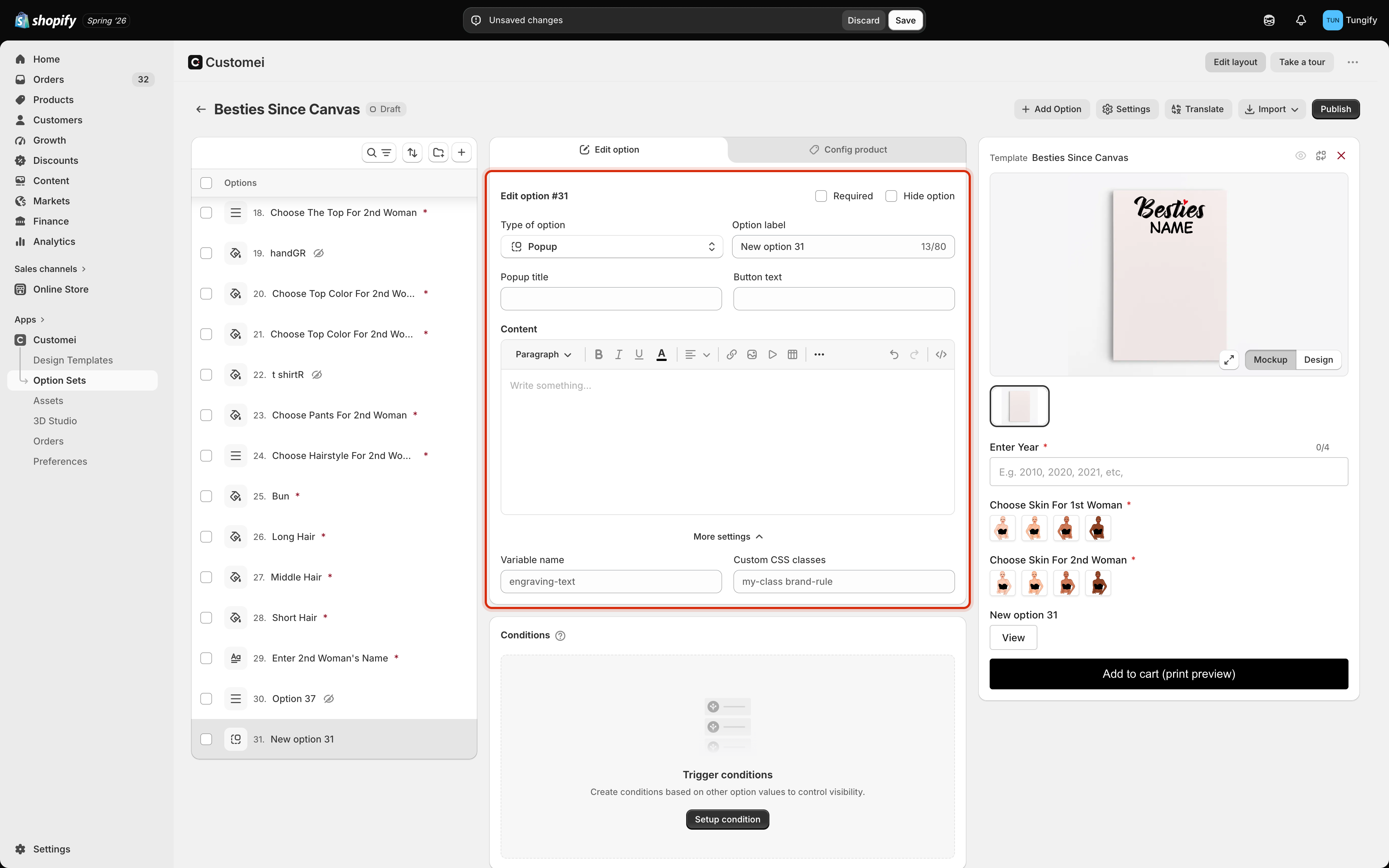 | Setting | What it does |
| --------------- | --------------------------------------------- |
| **Popup title** | The heading inside the window |
| **Button text** | The wording of the button on the product page |
| **Content** | What the window says, with formatting |
A popup collects nothing, so it never appears in the order and never blocks the cart.
## Countdown
A clock ticking down to a date you set. Use it for a cut-off: *order by this time for delivery before Christmas*.
| Setting | What it does |
| --------------- | --------------------------------------------- |
| **Popup title** | The heading inside the window |
| **Button text** | The wording of the button on the product page |
| **Content** | What the window says, with formatting |
A popup collects nothing, so it never appears in the order and never blocks the cart.
## Countdown
A clock ticking down to a date you set. Use it for a cut-off: *order by this time for delivery before Christmas*.
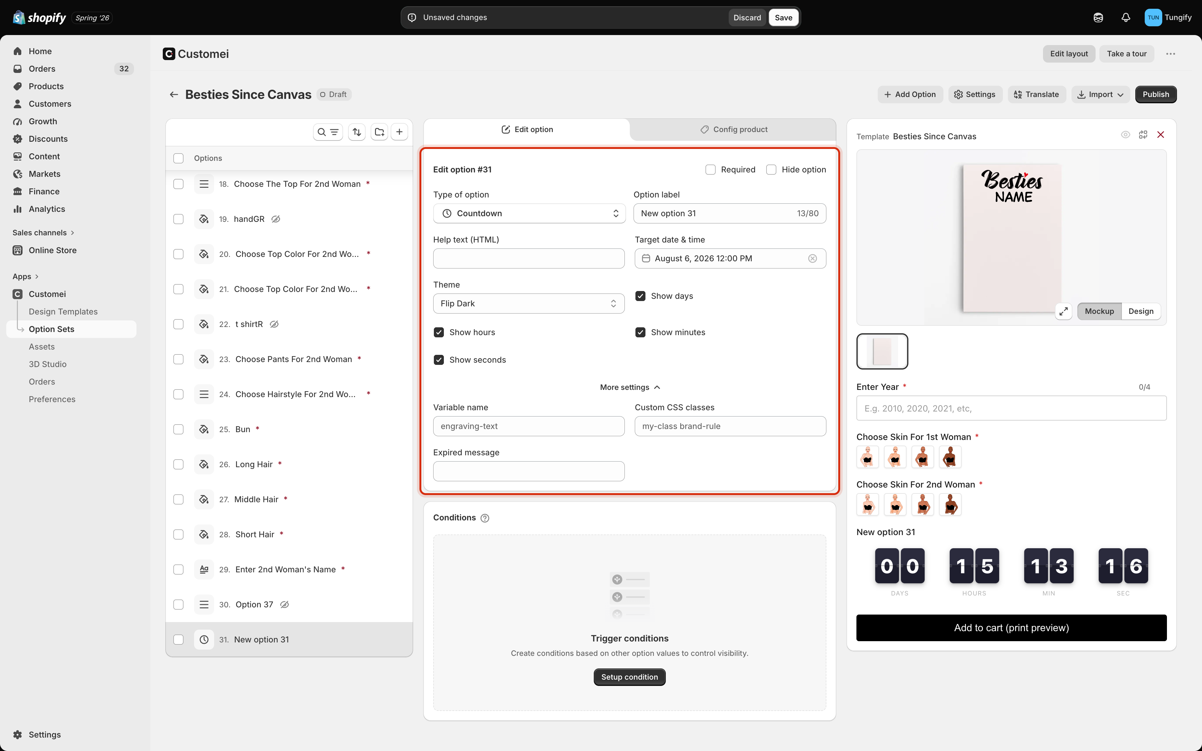 | Setting | What it does |
| ----------------------------------------- | ------------------------------------------------------------------------------------------------- |
| **Target date & time** | The moment the clock counts down to |
| **Theme** | The look: Flip Dark, Flip Light, Digital Light, Digital Dark, LCD Retro, Clock Wood or Clock Dark |
| **Show days / hours / minutes / seconds** | Which parts of the clock appear |
| **Expired message** | Under More settings. What replaces the clock once the moment passes |
A countdown does not stop anyone ordering. When it runs out, the **Expired message** appears and the product stays on sale. If a cut-off is a real deadline for you, write the expired message so it says so, and plan to change the date yourself.
## Crossword style
One more type sits in the same part of the picker. **Crossword style** has no settings of its own: it controls how a crossword built from the shopper's own words is laid out on the product page. Add it only if your design has a crossword layer.
## Where to next
Text, dates, colours and sliders.
Where to put these among your other questions.
| Setting | What it does |
| ----------------------------------------- | ------------------------------------------------------------------------------------------------- |
| **Target date & time** | The moment the clock counts down to |
| **Theme** | The look: Flip Dark, Flip Light, Digital Light, Digital Dark, LCD Retro, Clock Wood or Clock Dark |
| **Show days / hours / minutes / seconds** | Which parts of the clock appear |
| **Expired message** | Under More settings. What replaces the clock once the moment passes |
A countdown does not stop anyone ordering. When it runs out, the **Expired message** appears and the product stays on sale. If a cut-off is a real deadline for you, write the expired message so it says so, and plan to change the date yourself.
## Crossword style
One more type sits in the same part of the picker. **Crossword style** has no settings of its own: it controls how a crossword built from the shopper's own words is laid out on the product page. Add it only if your design has a crossword layer.
## Where to next
Text, dates, colours and sliders.
Where to put these among your other questions.