> ## Documentation Index
> Fetch the complete documentation index at: https://docs.customei.com/llms.txt
> Use this file to discover all available pages before exploring further.
# Lists and swatches
> Pick the right way to show a set of choices, and give each choice its own colour or picture.
Six option types show the shopper a list you wrote. They all collect the same thing, one of your choices, and differ only in how they look on the product page.
| Type | What the shopper sees | Best for |
| ------------------- | ------------------------------------------ | ------------------------------------ |
| **Dropdown** | A closed box that opens a list | Long lists where space is tight |
| **Radio buttons** | Every choice on its own line, one pickable | Two or three choices you want read |
| **Checkbox** | A single tickbox | One yes/no add-on, such as gift wrap |
| **Swatch** | Tappable tiles, each a colour or a picture | Colours, materials, artwork styles |
| **Dropdown swatch** | The same tiles, tucked inside a dropdown | Many colours on a crowded page |
| **Text swatch** | Tappable tiles with words on them | Sizes, fonts, short labels |
Use **Radio buttons** for three or fewer choices and a **Dropdown** above that. Shoppers decide faster when they can see everything at once, but a list of twenty items pushes the Add to cart button off the screen.
### Allow deselect
Every type here except **Checkbox** and **Radio buttons** has an **Allow deselect** setting. Turn it on and the shopper can clear their pick and go back to nothing chosen. Leave it off and, once they have chosen, they can only change to another choice.
Combine it with **Required** carefully: an option that is required but deselectable simply blocks the cart until they pick again.
## The choices themselves
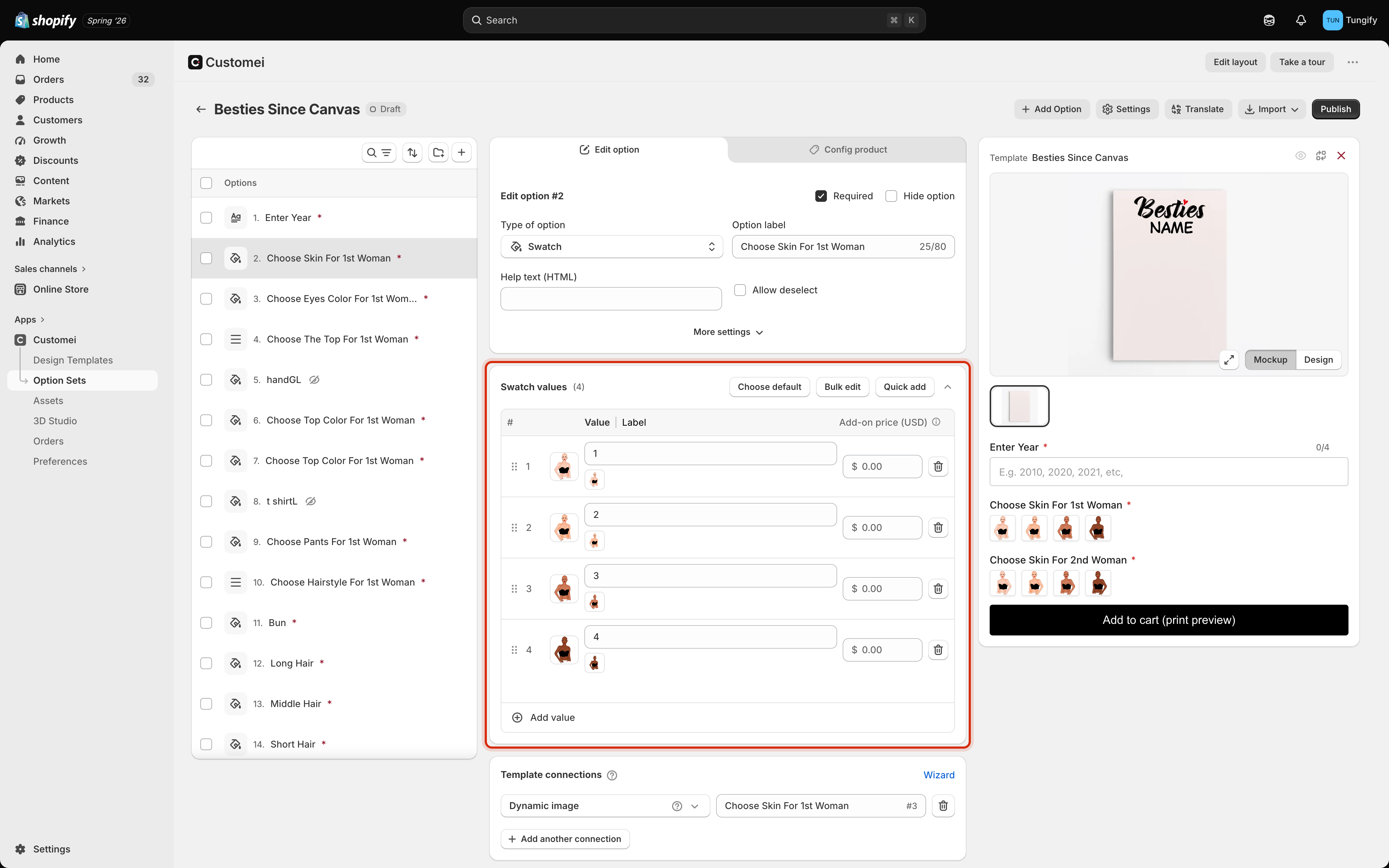
Under the settings you get the values table, one row per choice.
 | Column | What it's for |
| ---------------------- | ----------------------------------------------------------- |
| **Value** | The internal name. This is what gets matched to your design |
| **Label** | What the shopper reads. Leave it blank to reuse the value |
| **Add-on price (USD)** | Extra charged when this choice is picked |
Above the table:
* **Choose default** marks the choice the shopper starts on.
* **Bulk edit** lets you paste or rewrite the whole list at once. See [bulk add and edit values](/optionsets/bulk-add-and-edit-values).
* **Quick add** fills the list from a picture or colour library you have linked, so you don't retype anything. It is greyed out until a library is linked.
Drag the handle at the left of a row to reorder, and use the bin icon to remove one. **Add value** adds a row at the bottom. There is more on all of this in [managing values](/optionsets/managing-values) and [charging extra for a choice](/optionsets/value-price-add-ons).
## Giving a choice its own tile
On the three swatch types, each row has a small square next to it. Click it to decide what that tile looks like.
| Column | What it's for |
| ---------------------- | ----------------------------------------------------------- |
| **Value** | The internal name. This is what gets matched to your design |
| **Label** | What the shopper reads. Leave it blank to reuse the value |
| **Add-on price (USD)** | Extra charged when this choice is picked |
Above the table:
* **Choose default** marks the choice the shopper starts on.
* **Bulk edit** lets you paste or rewrite the whole list at once. See [bulk add and edit values](/optionsets/bulk-add-and-edit-values).
* **Quick add** fills the list from a picture or colour library you have linked, so you don't retype anything. It is greyed out until a library is linked.
Drag the handle at the left of a row to reorder, and use the bin icon to remove one. **Add value** adds a row at the bottom. There is more on all of this in [managing values](/optionsets/managing-values) and [charging extra for a choice](/optionsets/value-price-add-ons).
## Giving a choice its own tile
On the three swatch types, each row has a small square next to it. Click it to decide what that tile looks like.
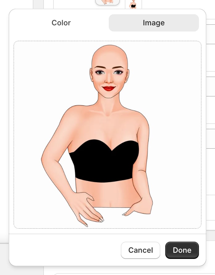 * **Colour** gives the tile a flat colour. Right for paint, thread, vinyl, mug colours.
* **Image** puts a picture on the tile, either from your library or uploaded here. Right for patterns, materials, and artwork styles a colour can't describe.
A tile is only how the choice *looks in the list*. It does not change the artwork on its own. That is what a [template connection](/optionsets/connect-to-a-template) does. It is worth making the two match, so a tile showing a red heart really does put the red heart on the product.
If your choices came from a linked library, their rows are locked and the tiles come from the library items. Change the picture in the library rather than here. See [keep options up to date](/optionsets/keep-options-up-to-date).
## Where to next
Ready-made layouts, or your own HTML and CSS.
Add a surcharge to the choices that cost you more.
* **Colour** gives the tile a flat colour. Right for paint, thread, vinyl, mug colours.
* **Image** puts a picture on the tile, either from your library or uploaded here. Right for patterns, materials, and artwork styles a colour can't describe.
A tile is only how the choice *looks in the list*. It does not change the artwork on its own. That is what a [template connection](/optionsets/connect-to-a-template) does. It is worth making the two match, so a tile showing a red heart really does put the red heart on the product.
If your choices came from a linked library, their rows are locked and the tiles come from the library items. Change the picture in the library rather than here. See [keep options up to date](/optionsets/keep-options-up-to-date).
## Where to next
Ready-made layouts, or your own HTML and CSS.
Add a surcharge to the choices that cost you more.