> ## Documentation Index
> Fetch the complete documentation index at: https://docs.customei.com/llms.txt
> Use this file to discover all available pages before exploring further.
# Match the options to your store's look
> Set the colours, sizes, roundness and spacing of your questions, watch them change in a live preview, and save more than one look.
The questions Customei adds to your product page come with a plain, tidy look. This tab is where you make them look like the rest of your store: your colours, your corners, your text size.
You change a setting on the left and watch a real form change on the right. Nothing here needs code.
Go to **Preferences** and open the **Theme** tab.
 ## How you work here
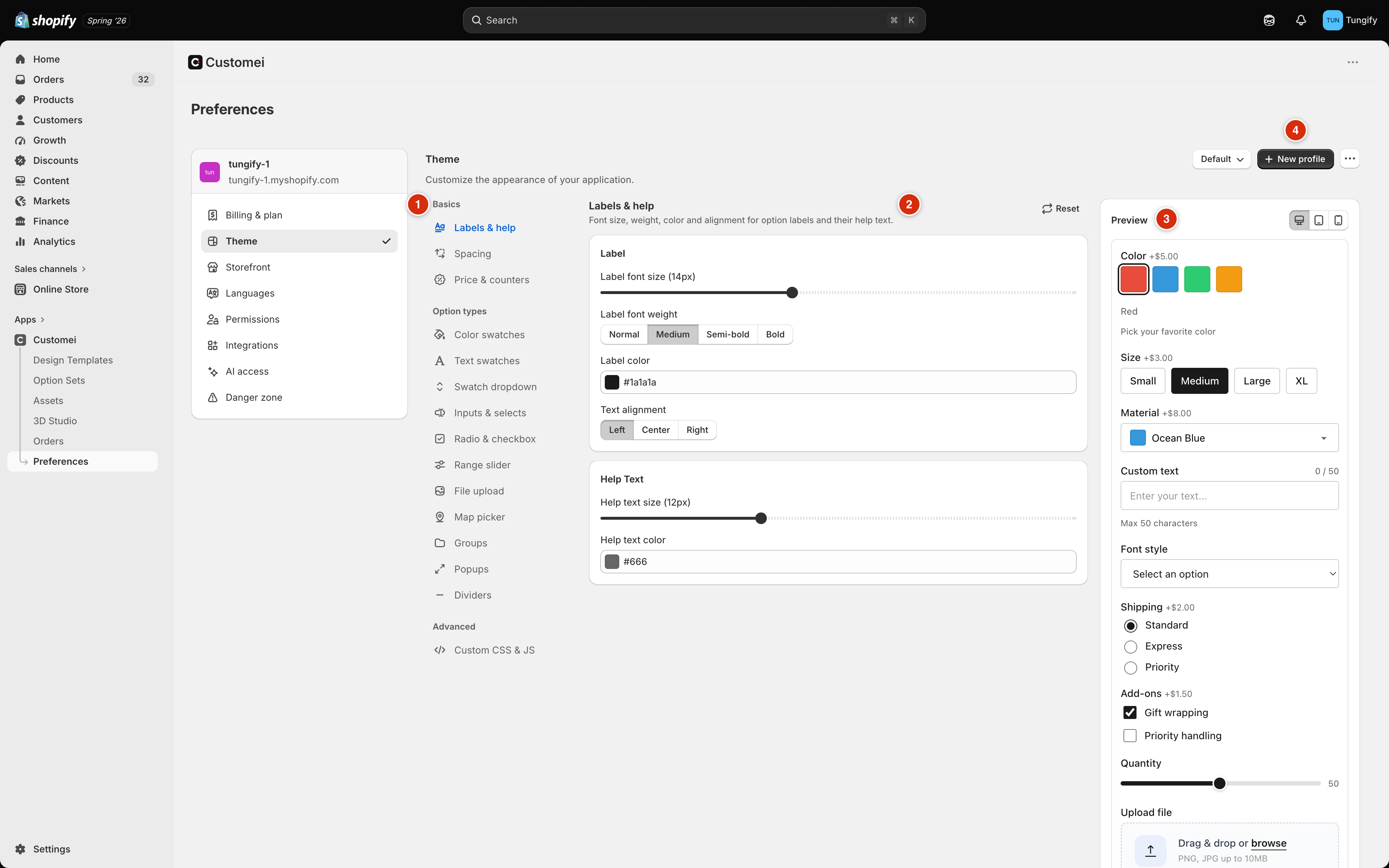
The list on the left is a list of things on the form, not a list of pages. **Basics** is the stuff every question shares. **Option types** is one entry per kind of question.
Sliders for sizes, colour boxes for colours, small button rows for choices like *Left / Center / Right*.
The panel on the right is a working form. It changes as you drag.
A bar appears at the top with **Save** and **Cancel**. Save it and your storefront picks up the new look within a few seconds. You don't have to publish your option sets again.
## Basics: what every question shares
Start here. These three cover the things a customer notices first.
| Category | What it sets |
| -------------------- | --------------------------------------------------------------------------------------------------------------- |
| **Labels & help** | The size, weight, colour and alignment of a question's label, and of the small grey line of help text under it. |
| **Spacing** | How much air sits between one question and the next, and between a label and its box. |
| **Price & counters** | The little *+\$5.00* badge on a choice that costs extra, and the character counter on a typing box. |
Getting **Labels & help** to match your theme's own text is usually enough to make the whole form look like it belongs. Do that before you touch anything else.
## Option types: one kind of question at a time
Each entry under **Option types** styles one kind of question wherever it appears in your store.
| Category | The thing it styles |
| -------------------- | --------------------------------------------------------- |
| **Color swatches** | The little coloured or picture squares a customer clicks. |
| **Text swatches** | Pill-shaped chips for short words, like sizes. |
| **Swatch dropdown** | A dropdown with a colour dot beside each line. |
| **Inputs & selects** | Typing boxes, dropdowns, date pickers and colour pickers. |
| **Radio & checkbox** | Round buttons and tick boxes. |
| **Range slider** | The drag-a-handle number picker. |
| **File upload** | The box a customer drops a photo into. |
| **Map picker** | The search box and map for choosing a place. |
| **Groups** | The box that folds a set of questions together. |
| **Popups** | The window that opens with extra questions inside. |
| **Dividers** | The labelled line between sections of questions. |
Pick one and the settings are grouped into small cards: the size and shape, the colours, and how it looks when the customer interacts with it.
## How you work here
The list on the left is a list of things on the form, not a list of pages. **Basics** is the stuff every question shares. **Option types** is one entry per kind of question.
Sliders for sizes, colour boxes for colours, small button rows for choices like *Left / Center / Right*.
The panel on the right is a working form. It changes as you drag.
A bar appears at the top with **Save** and **Cancel**. Save it and your storefront picks up the new look within a few seconds. You don't have to publish your option sets again.
## Basics: what every question shares
Start here. These three cover the things a customer notices first.
| Category | What it sets |
| -------------------- | --------------------------------------------------------------------------------------------------------------- |
| **Labels & help** | The size, weight, colour and alignment of a question's label, and of the small grey line of help text under it. |
| **Spacing** | How much air sits between one question and the next, and between a label and its box. |
| **Price & counters** | The little *+\$5.00* badge on a choice that costs extra, and the character counter on a typing box. |
Getting **Labels & help** to match your theme's own text is usually enough to make the whole form look like it belongs. Do that before you touch anything else.
## Option types: one kind of question at a time
Each entry under **Option types** styles one kind of question wherever it appears in your store.
| Category | The thing it styles |
| -------------------- | --------------------------------------------------------- |
| **Color swatches** | The little coloured or picture squares a customer clicks. |
| **Text swatches** | Pill-shaped chips for short words, like sizes. |
| **Swatch dropdown** | A dropdown with a colour dot beside each line. |
| **Inputs & selects** | Typing boxes, dropdowns, date pickers and colour pickers. |
| **Radio & checkbox** | Round buttons and tick boxes. |
| **Range slider** | The drag-a-handle number picker. |
| **File upload** | The box a customer drops a photo into. |
| **Map picker** | The search box and map for choosing a place. |
| **Groups** | The box that folds a set of questions together. |
| **Popups** | The window that opens with extra questions inside. |
| **Dividers** | The labelled line between sections of questions. |
Pick one and the settings are grouped into small cards: the size and shape, the colours, and how it looks when the customer interacts with it.
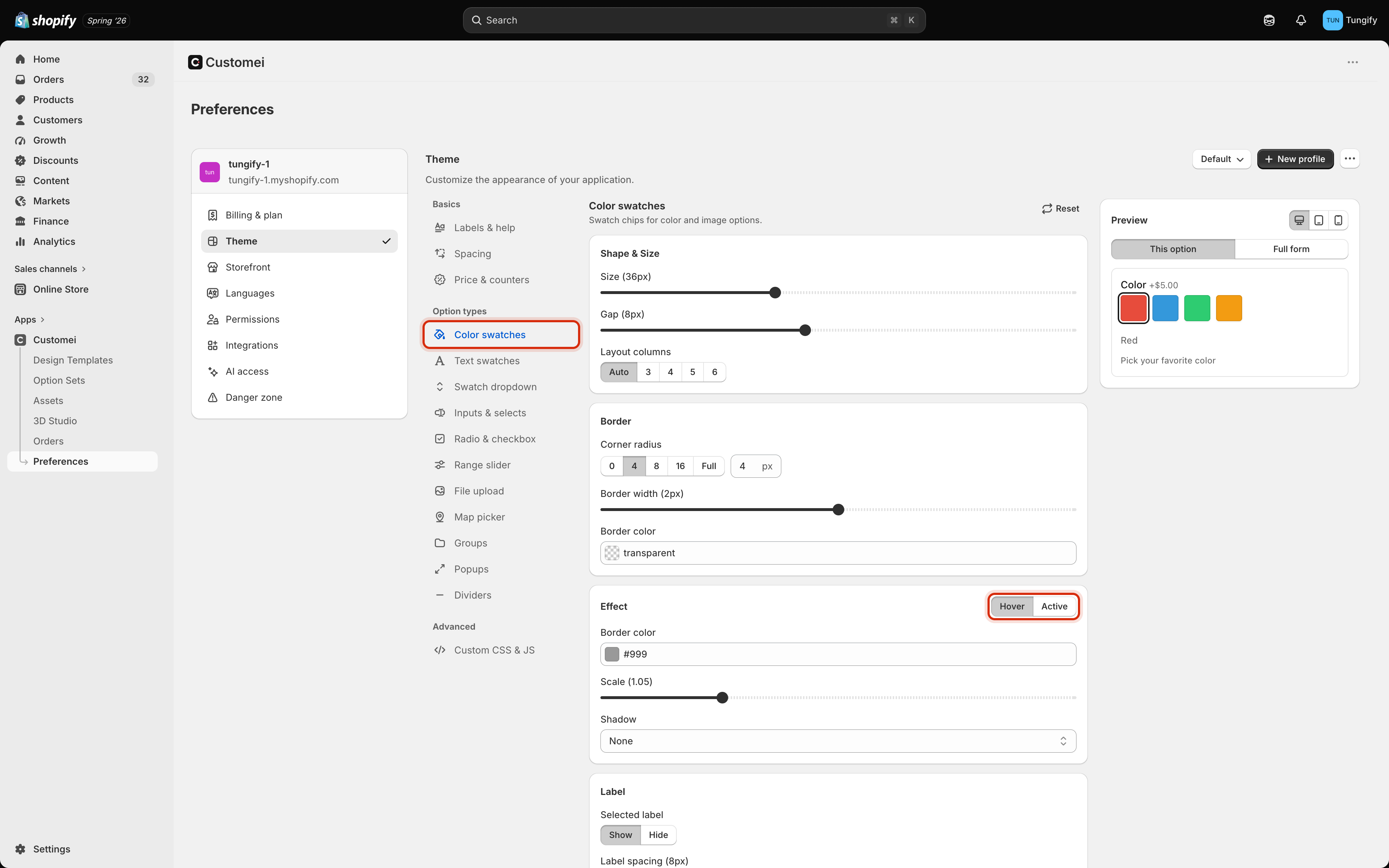 Where you see **Hover** and **Active** together, you are looking at two different moments, not two settings:
* **Hover** is how it looks while the customer's mouse is over it.
* **Active** is how it looks once they have chosen it.
Make **Active** clearly different from the rest. If a chosen swatch looks the same as an unchosen one, customers pick twice and get confused.
**Reset**, at the top right of the settings, puts *only the category you are looking at* back to how it started. **Cancel** in the save bar throws away everything you changed since your last save.
## The live preview
The preview is not a picture, it is a working form with sample questions in it. Click the chips, type in the box.
Where you see **Hover** and **Active** together, you are looking at two different moments, not two settings:
* **Hover** is how it looks while the customer's mouse is over it.
* **Active** is how it looks once they have chosen it.
Make **Active** clearly different from the rest. If a chosen swatch looks the same as an unchosen one, customers pick twice and get confused.
**Reset**, at the top right of the settings, puts *only the category you are looking at* back to how it started. **Cancel** in the save bar throws away everything you changed since your last save.
## The live preview
The preview is not a picture, it is a working form with sample questions in it. Click the chips, type in the box.
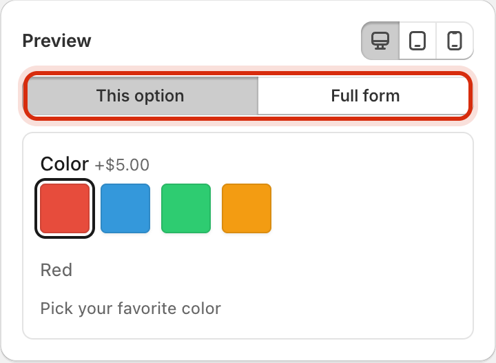 * **This option** shows just the kind of question you are editing, so nothing else distracts you.
* **Full form** shows a whole form with every kind of question in it, which is how you catch a colour that looks fine alone and clashes in a crowd.
* The three small icons at the top right shrink the preview to a desktop, a tablet and a phone width. Check the phone before you save; that is where most of your customers are.
## Saving more than one look
The names beside the title are saved looks, called **profiles**. A profile is one complete set of the settings on this page. Most stores need one. A second is handy for a seasonal look you plan to switch to and back from.
* **This option** shows just the kind of question you are editing, so nothing else distracts you.
* **Full form** shows a whole form with every kind of question in it, which is how you catch a colour that looks fine alone and clashes in a crowd.
* The three small icons at the top right shrink the preview to a desktop, a tablet and a phone width. Check the phone before you save; that is where most of your customers are.
## Saving more than one look
The names beside the title are saved looks, called **profiles**. A profile is one complete set of the settings on this page. Most stores need one. A second is handy for a seasonal look you plan to switch to and back from.
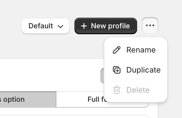 * The dropdown on the left shows which profile is live. Switch it and your storefront changes to that look right away.
* **New profile** makes another one, asks for a name, and switches to it.
* The **…** menu holds **Rename**, **Duplicate** (a copy to experiment on, so your live look stays untouched) and **Delete**.
* **Delete** is greyed out when you only have one profile, because something has to be live.
These buttons are all switched off while you have unsaved changes. Save or **Cancel** first, then switch or copy. It stops you from carrying half-finished edits into another profile by accident.
There is one look for your whole account. Change it and every product page using Customei changes with it, live, as soon as you save.
## Where to next
The other half of how your product page is arranged.
Try the real thing, on your own option set.
* The dropdown on the left shows which profile is live. Switch it and your storefront changes to that look right away.
* **New profile** makes another one, asks for a name, and switches to it.
* The **…** menu holds **Rename**, **Duplicate** (a copy to experiment on, so your live look stays untouched) and **Delete**.
* **Delete** is greyed out when you only have one profile, because something has to be live.
These buttons are all switched off while you have unsaved changes. Save or **Cancel** first, then switch or copy. It stops you from carrying half-finished edits into another profile by accident.
There is one look for your whole account. Change it and every product page using Customei changes with it, live, as soon as you save.
## Where to next
The other half of how your product page is arranged.
Try the real thing, on your own option set.