> ## Documentation Index
> Fetch the complete documentation index at: https://docs.customei.com/llms.txt
> Use this file to discover all available pages before exploring further.
# Create a design template
> Pick a canvas size, lay out your artwork, and learn the layer numbers your option set will point at.
This walkthrough takes you from an empty canvas to a saved design template that's ready to be personalized.
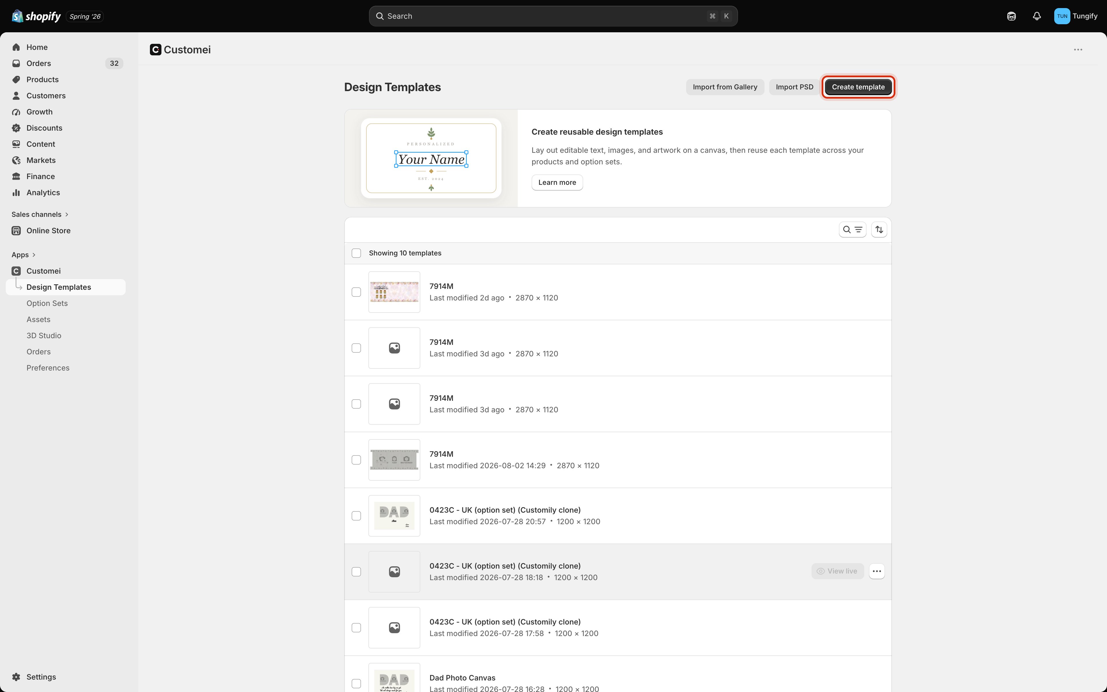
Go to **Design Templates** and click **Create template**.
 Pick one of the ready-made artboard sizes, or set your own width and height.
 | Preset | Size |
| ------------- | -------------- |
| T-Shirt | 14 × 16 in |
| Pants | 12 × 14 in |
| Tote Bag | 15 × 16 in |
| Mug Wrap | 2550 × 1155 px |
| Phone Case | 3 × 6 in |
| Sticker | 4 × 4 in |
| Poster | 16 × 20 in |
| Postcard | 4 × 6 in |
| Business Card | 3.5 × 2 in |
For a custom size, type a **width** and **height** and pick your **unit**: pixels, centimetres, millimetres, or inches. If you work in a physical unit, set the **DPI** to match what your printer expects; 300 is the usual choice for print.
Give the template a name you'll recognise later, because you'll be picking it from a list when you build the option set. Then click **Create**.
Use the size your printer asks for, not the size of the product photo. The canvas is what gets printed.
The template opens straight into the design editor.
| Preset | Size |
| ------------- | -------------- |
| T-Shirt | 14 × 16 in |
| Pants | 12 × 14 in |
| Tote Bag | 15 × 16 in |
| Mug Wrap | 2550 × 1155 px |
| Phone Case | 3 × 6 in |
| Sticker | 4 × 4 in |
| Poster | 16 × 20 in |
| Postcard | 4 × 6 in |
| Business Card | 3.5 × 2 in |
For a custom size, type a **width** and **height** and pick your **unit**: pixels, centimetres, millimetres, or inches. If you work in a physical unit, set the **DPI** to match what your printer expects; 300 is the usual choice for print.
Give the template a name you'll recognise later, because you'll be picking it from a list when you build the option set. Then click **Create**.
Use the size your printer asks for, not the size of the product photo. The canvas is what gets printed.
The template opens straight into the design editor.
 The two canvases side by side are the part worth understanding:
* **Design Template** is the artwork itself, at print size. This is what ends up on the product.
* **Design Preview** wraps that artwork onto a photo of the real product, so you and your customer can see how it will look.
Anything you add while the **Design Preview** frame is selected stays on the preview only. It is never printed. If the Elements panel warns you that you're editing the Design Preview, click the **Design Template** canvas first.
There's more to the two frames than this: how the preview keeps up with your design, and what happens when it stops. See [The design and preview frames](/editor/design-and-preview-frames).
Open the **Elements** panel from the top of the tool rail and click what you want to add.
The two canvases side by side are the part worth understanding:
* **Design Template** is the artwork itself, at print size. This is what ends up on the product.
* **Design Preview** wraps that artwork onto a photo of the real product, so you and your customer can see how it will look.
Anything you add while the **Design Preview** frame is selected stays on the preview only. It is never printed. If the Elements panel warns you that you're editing the Design Preview, click the **Design Template** canvas first.
There's more to the two frames than this: how the preview keeps up with your design, and what happens when it stops. See [The design and preview frames](/editor/design-and-preview-frames).
Open the **Elements** panel from the top of the tool rail and click what you want to add.
 | Element | Use it for |
| ------------------------------------------------ | --------------------------------------------------------- |
| **Text** | Names, dates, messages, anything a customer types |
| **Image** | A fixed picture that never changes |
| **Dynamic Image** | A picture that swaps depending on what the customer picks |
| **QR Code** | A code built from a link the customer enters |
| **Calendar** | A date shown as a calendar page |
| **Moon Phase** / **Star Map** | The night sky on a date the customer chooses |
| **Map** | A location the customer searches for |
| **Crossword** / **Word Search** / **Word Cloud** | A puzzle or cloud built from words the customer types |
| **Spotify Player** | A scannable player for a track the customer links |
Select anything on the canvas and its settings (font, size, colour, position) appear in the panel on the right.
For a first template, one **Text** layer and one **Image** layer is plenty. You can always add more later.
Open the **Layers** panel from the tool rail. Every layer on your canvas is listed with a number next to it.
| Element | Use it for |
| ------------------------------------------------ | --------------------------------------------------------- |
| **Text** | Names, dates, messages, anything a customer types |
| **Image** | A fixed picture that never changes |
| **Dynamic Image** | A picture that swaps depending on what the customer picks |
| **QR Code** | A code built from a link the customer enters |
| **Calendar** | A date shown as a calendar page |
| **Moon Phase** / **Star Map** | The night sky on a date the customer chooses |
| **Map** | A location the customer searches for |
| **Crossword** / **Word Search** / **Word Cloud** | A puzzle or cloud built from words the customer types |
| **Spotify Player** | A scannable player for a track the customer links |
Select anything on the canvas and its settings (font, size, colour, position) appear in the panel on the right.
For a first template, one **Text** layer and one **Image** layer is plenty. You can always add more later.
Open the **Layers** panel from the tool rail. Every layer on your canvas is listed with a number next to it.
 **This is the most important thing on the page.** When you later tell an option set *"put the customer's answer here"*, you point it at one of these numbers. An option connected to `#14` writes into this exact text layer.
Two habits will save you a lot of confusion later:
* **Name your layers.** Double-click a layer name and type something you'll recognise, such as *Kid's Name* or *Background photo*. In the option set you'll see the name next to the number.
* **Watch for repeats.** Layer numbers are not always unique. In the screenshot above, three separate layers are called *Kid's Name*, and elsewhere in the same template two layers share the number `#3`.
If two layers share a number, an option connected to that number may change the wrong one. When you pick the layer in the option set, Customei asks you which of the matching layers you meant. Choose carefully, and rename the layers so you can tell them apart.
Click **Save** in the top right. The badge beside the template name switches to **Saved** once it's stored.
Your template is now ready to be used by an option set.
## Keyboard shortcuts
| Shortcut | Does |
| ------------------------------------------------------------------------------- | ------------------------- |
| ⌘ S | Save |
| ⌘ ⇧ S | Save and publish |
| ⌘ Z | Undo |
| ⌘ ⇧ Z | Redo |
| ⌘ D | Duplicate |
| delete | Delete |
| ⌘ C / ⌘ V | Copy / paste |
| ⌘ ⌥ C / ⌘ ⌥ V | Copy / paste style |
| hold ⌘ | Select more than one item |
In the layer list: ↑ ↓ move between layers, → opens a group, ← closes it, and enter renames the selected layer.
## Where to next
Turn your template into questions a shopper can answer.
Point an answer at the layer number you just checked.
Which canvas gets printed, and how the preview follows it.
Show your artwork on a photo of the real product.
**This is the most important thing on the page.** When you later tell an option set *"put the customer's answer here"*, you point it at one of these numbers. An option connected to `#14` writes into this exact text layer.
Two habits will save you a lot of confusion later:
* **Name your layers.** Double-click a layer name and type something you'll recognise, such as *Kid's Name* or *Background photo*. In the option set you'll see the name next to the number.
* **Watch for repeats.** Layer numbers are not always unique. In the screenshot above, three separate layers are called *Kid's Name*, and elsewhere in the same template two layers share the number `#3`.
If two layers share a number, an option connected to that number may change the wrong one. When you pick the layer in the option set, Customei asks you which of the matching layers you meant. Choose carefully, and rename the layers so you can tell them apart.
Click **Save** in the top right. The badge beside the template name switches to **Saved** once it's stored.
Your template is now ready to be used by an option set.
## Keyboard shortcuts
| Shortcut | Does |
| ------------------------------------------------------------------------------- | ------------------------- |
| ⌘ S | Save |
| ⌘ ⇧ S | Save and publish |
| ⌘ Z | Undo |
| ⌘ ⇧ Z | Redo |
| ⌘ D | Duplicate |
| delete | Delete |
| ⌘ C / ⌘ V | Copy / paste |
| ⌘ ⌥ C / ⌘ ⌥ V | Copy / paste style |
| hold ⌘ | Select more than one item |
In the layer list: ↑ ↓ move between layers, → opens a group, ← closes it, and enter renames the selected layer.
## Where to next
Turn your template into questions a shopper can answer.
Point an answer at the layer number you just checked.
Which canvas gets printed, and how the preview follows it.
Show your artwork on a photo of the real product.