In a hurry? The first option set quickstart builds a minimal two-field set in five minutes. This page is the complete walkthrough.
1. Create the option set
From the sidebar open Option Sets, then click Create:
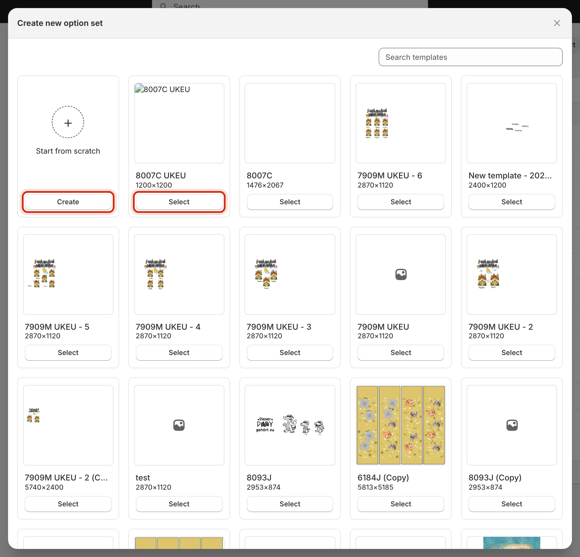
- Start from scratch — an empty set; you add every option by hand.
- Select a design template — Customei scans the template’s layers and seeds a matching option for each personalizable one: text layers become text inputs, image slots become uploads, and so on. The seeding runs in the background — a Generating fields from template… toast shows until the options appear.
2. Find your way around the editor
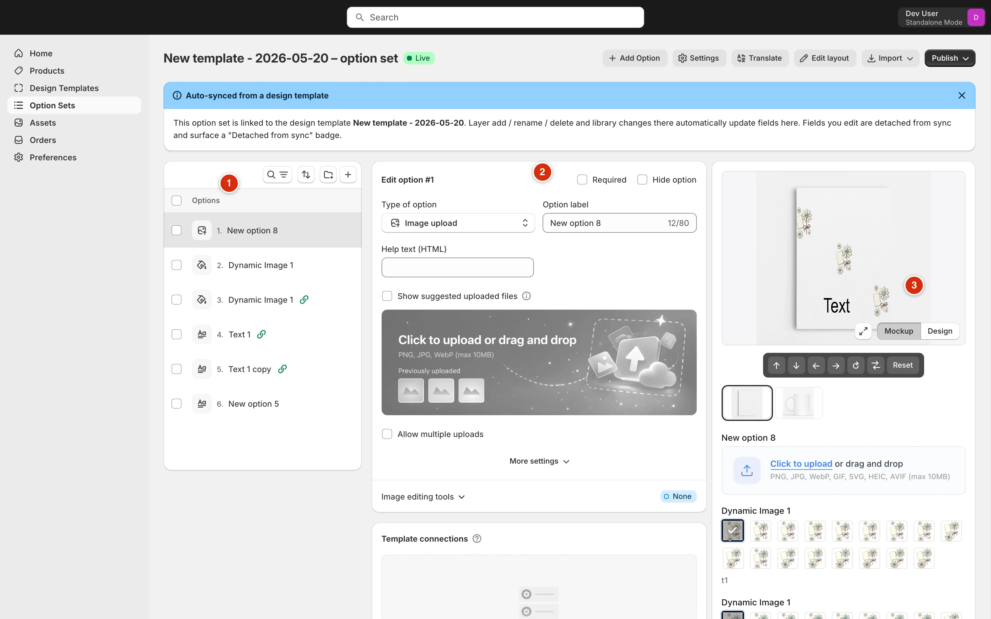
- Options list — every option in the set, in the order customers will see them. Drag to reorder; the toolbar above has search, filtering, and a + shortcut for adding options.
- Edit panel — the selected option’s settings: its type, label, type-specific controls, Template connections, and Conditions.
- Live preview — the form exactly as the storefront widget renders it, against the linked template. Toggle Mockup / Design to preview on the product photo or the flat design.
3. Add an option and pick its type
Click + Add Option in the header. A new option appears in the list — then choose what kind of input it is from the Type of option dropdown: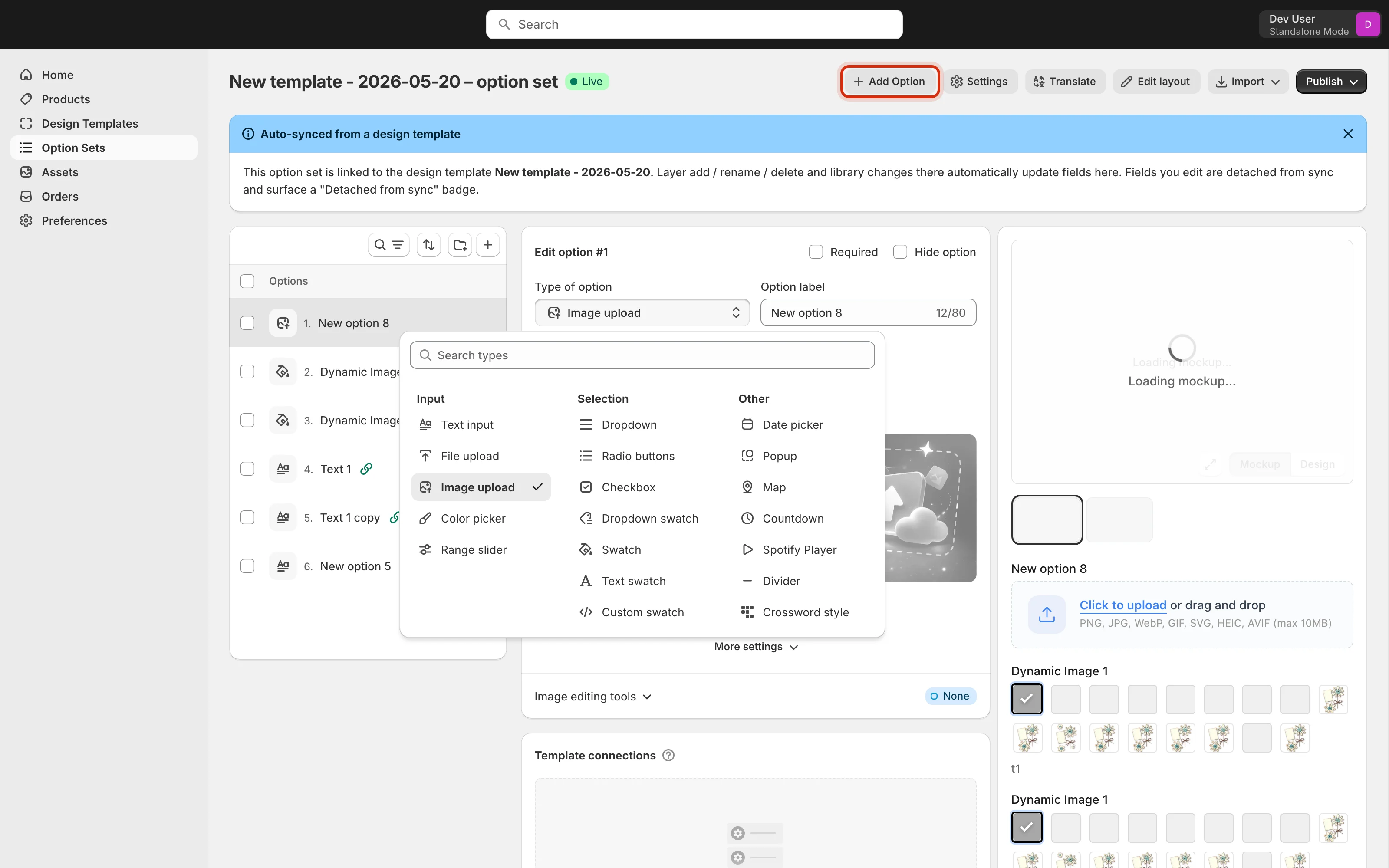
| Group | Types | Use when |
|---|---|---|
| Input | Text input, File upload, Image upload, Color picker, Range slider | The customer supplies the content — a name, a photo, a free color. |
| Selection | Dropdown, Radio buttons, Checkbox, Dropdown swatch, Swatch, Text swatch, Custom swatch | The customer picks from values you define. Swatch variants show a color or image chip instead of plain text. |
| Other | Date picker, Popup, Map, Countdown, Spotify Player, Divider, Crossword style | Special-purpose options — star maps, song players, layout dividers, info popups. |
4. Configure the option
Select an option to open its settings. Give it a customer-facing Option label, decide whether it’s Required, and use Hide option to keep it out of the storefront form without deleting it. Each type brings its own controls — a text input has placeholder, initial value, max length, and a textarea toggle; an upload has file-type limits; a swatch has its value list.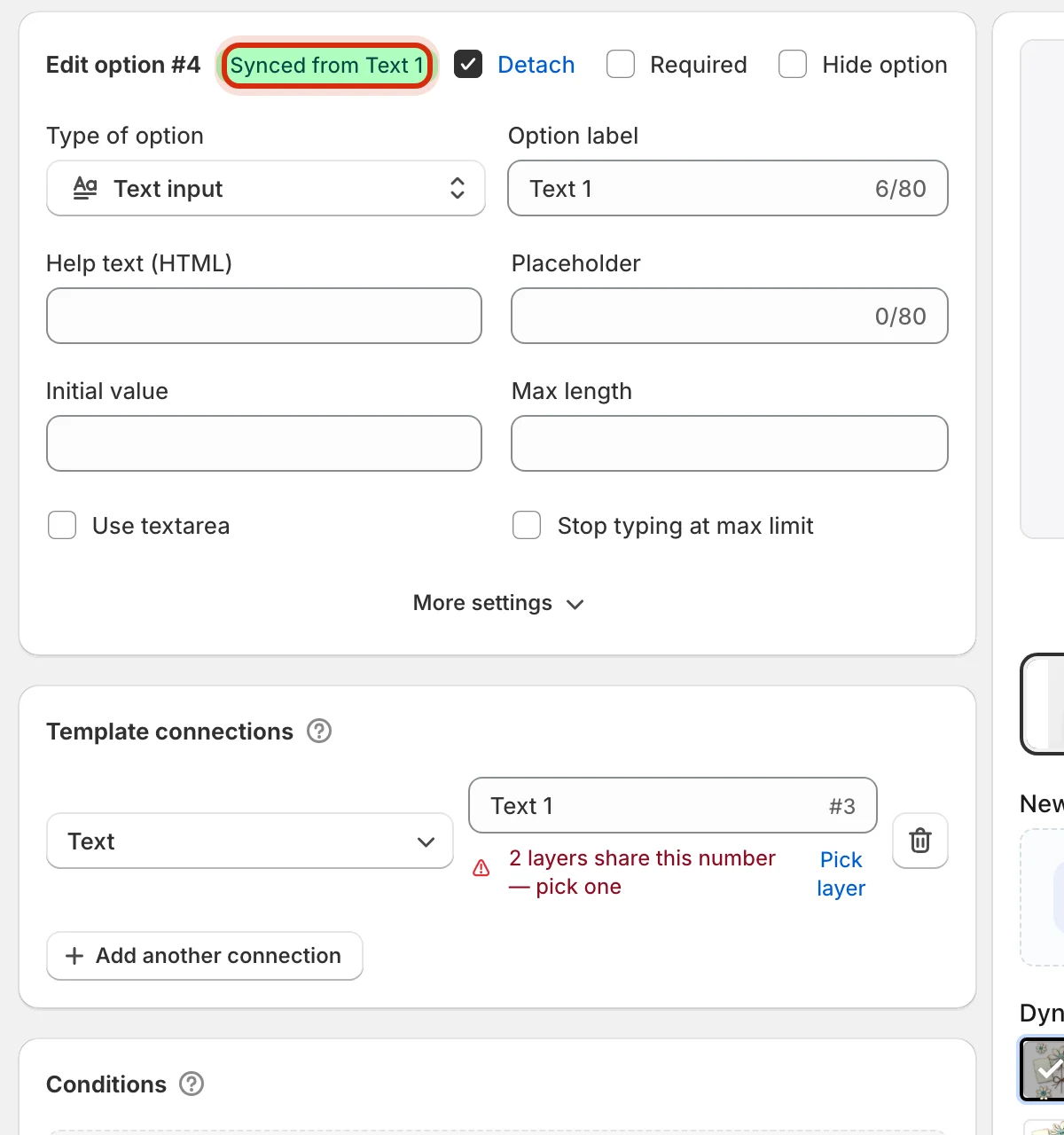
Connect it to the template
Template connections is what makes an option actually drive the design. Each connection maps the option to one layer property — a text option to a text layer’s content, a swatch to an image slot or a fill color: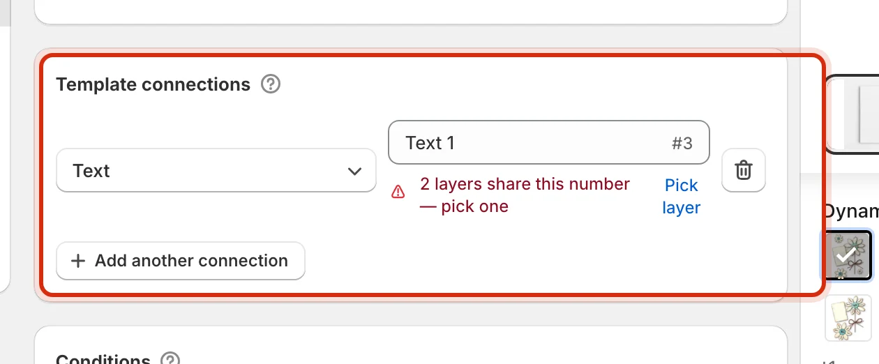
Values — what the customer can pick
Selection types (swatches, dropdowns, radio buttons) carry a value list: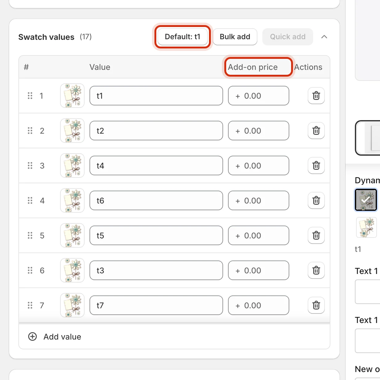
- Drag rows to reorder — customers see values in exactly this order.
- Each value can carry an Add-on price — the extra charge applied when the customer picks it.
- Default sets which value is pre-selected; Bulk add pastes many values at once.
Conditions — show and hide options
Scroll to Conditions and click Setup condition to control visibility with rules like show this option only when Style is Custom text: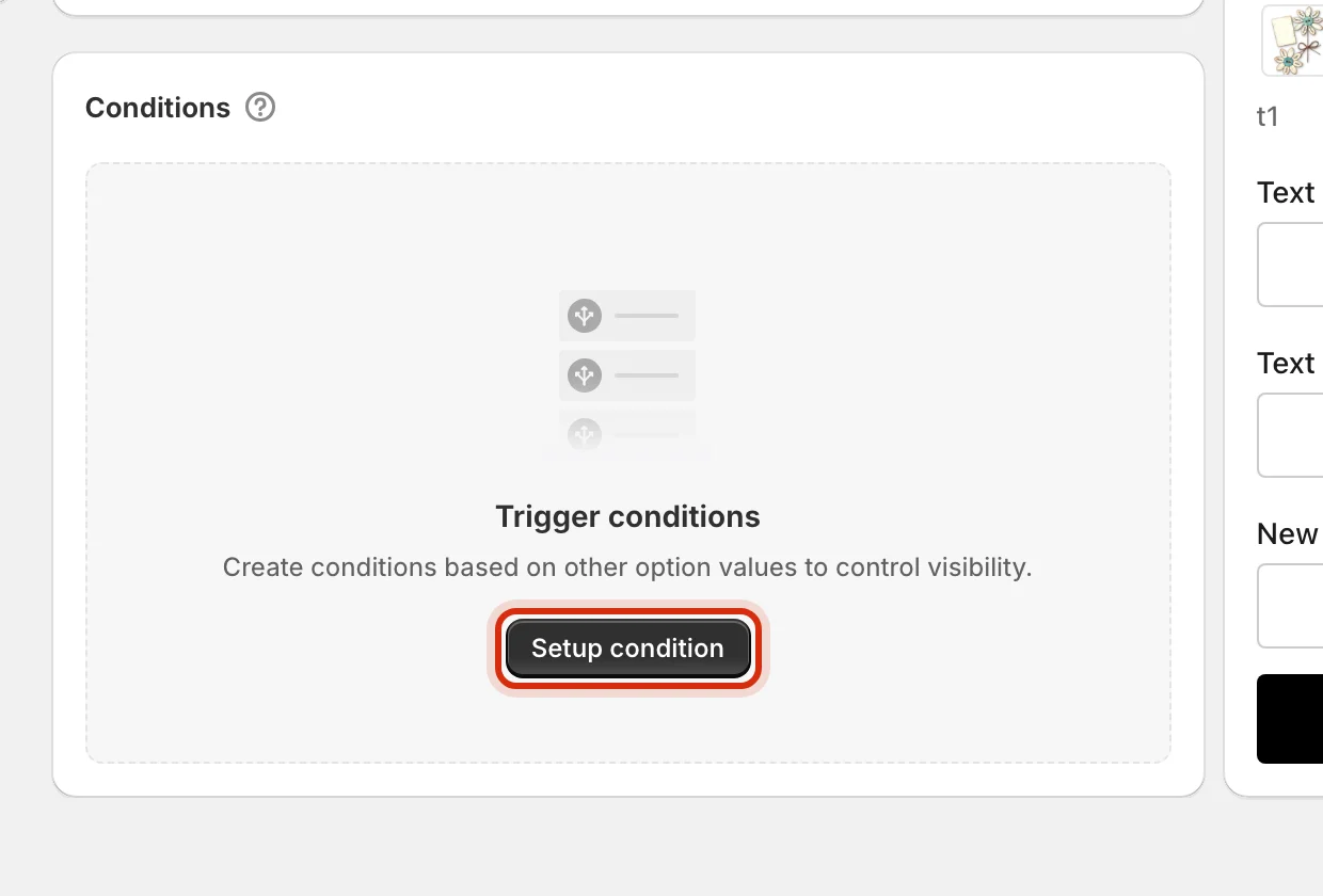
5. Save — then publish
Editing never goes live by itself. As soon as you change anything, a save bar appears: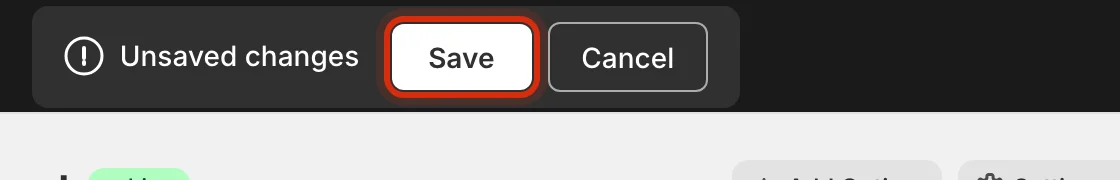
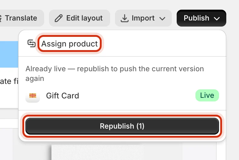
6. Assign it to products
An option set does nothing until a product points at it. Assign product (in the Publish popover) opens the assignment canvas: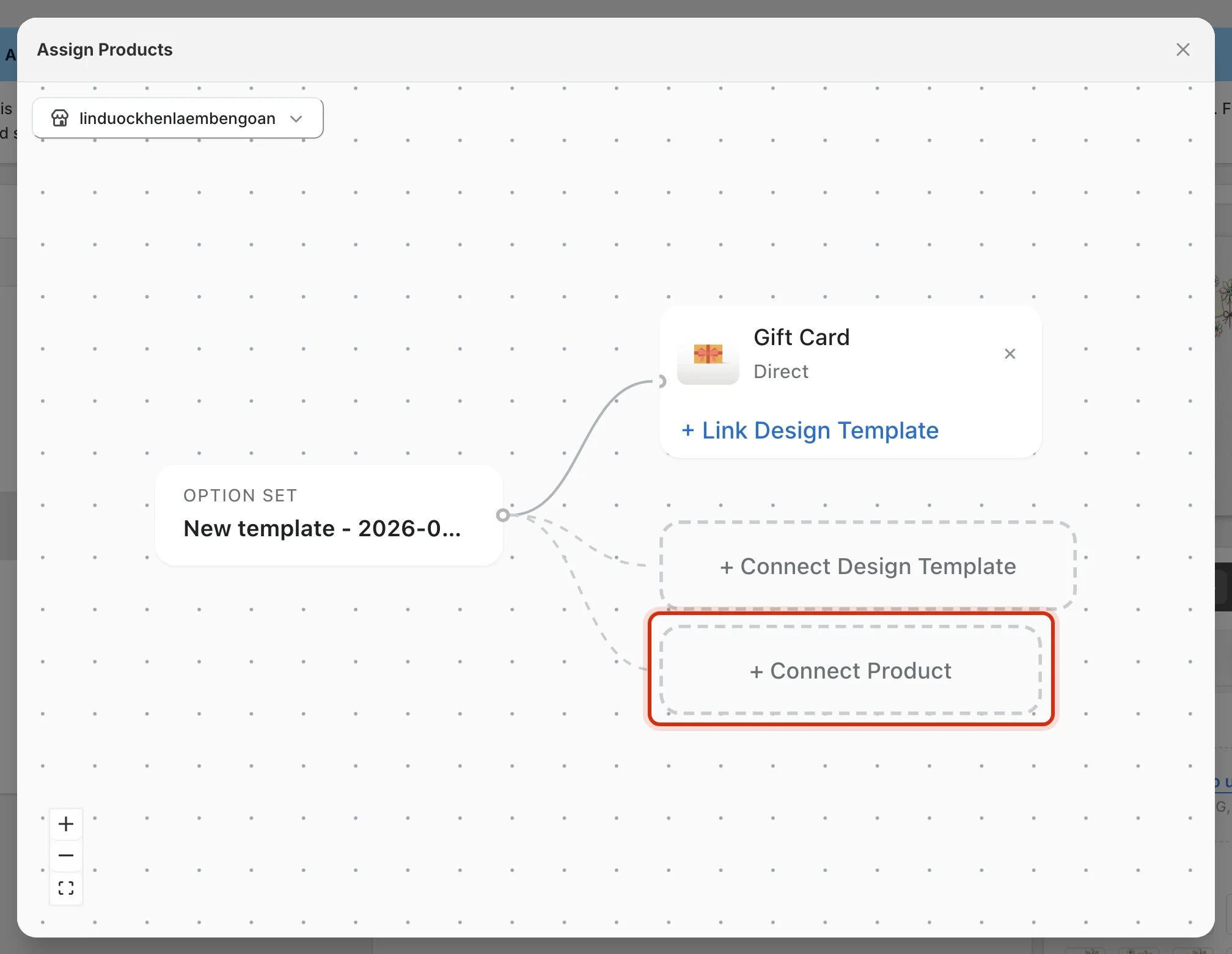
Next steps
Publish to your storefront
Enable the theme extension and place a test order.
Translate the option set
Ship the same form in every language your store sells in.
Key concepts
Templates, bundles, connections — the vocabulary behind this page.
Troubleshooting
Widget missing, options not saving, and other quick fixes.