

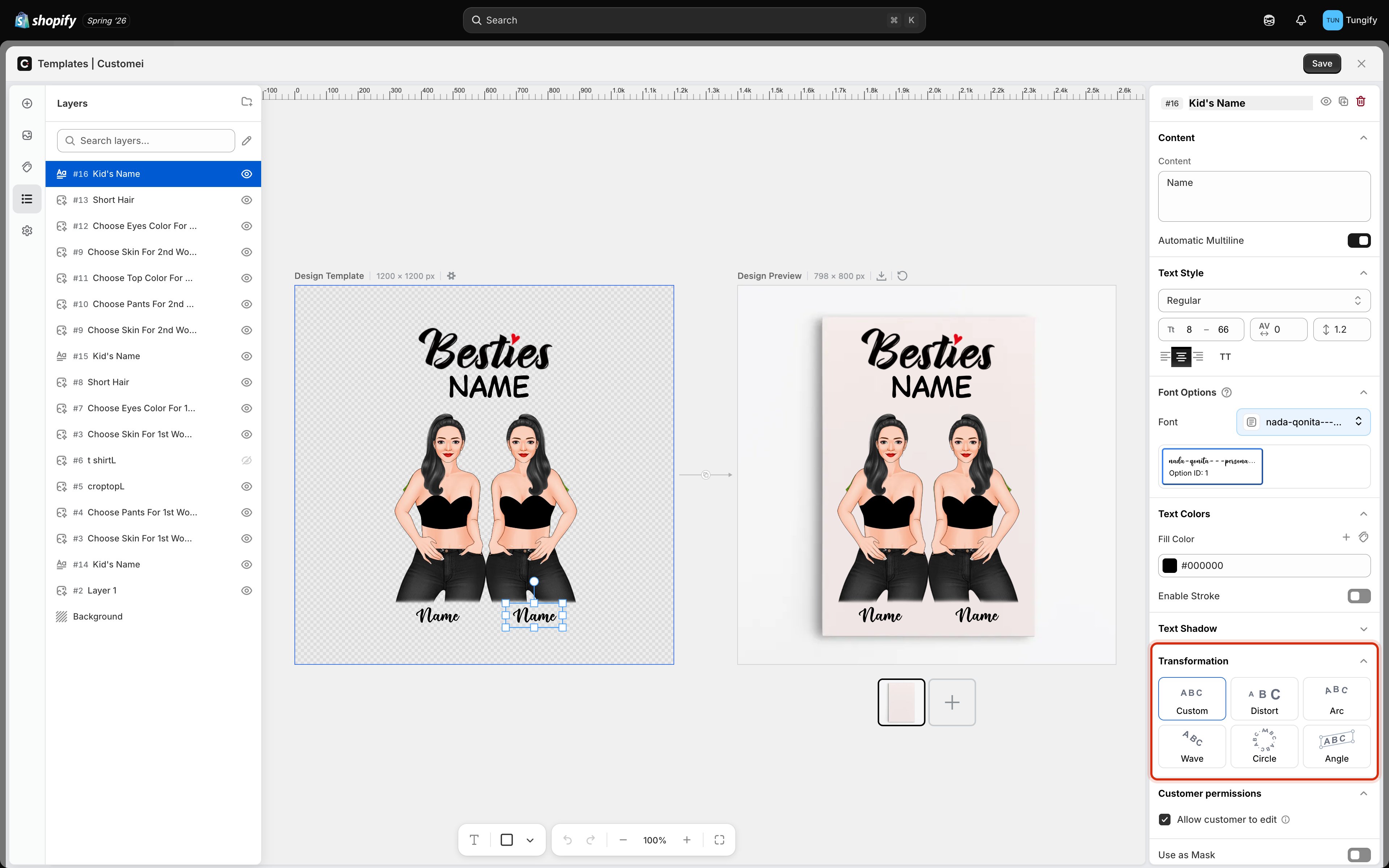
The Transformation section, with the six shapes a text layer can take.
The six shapes
Click a shape to apply it. Handles appear on the canvas so you can drag the curve into place, and the controls under the tiles let you set the amount precisely.
Choosing the right one
- Arc is the everyday choice. Names over a photo, slogans on a chest print, text following the top of a badge.
- Circle suits anything genuinely round: a plate rim, a coaster, a stamp-style crest. It works best with short text and generous letter spacing.
- Angle is for perspective. If your mockup shows a product photographed at a tilt, a skewed layer sits on it far more convincingly than a straight one.
- Wave is decorative. It is striking on one short line and quickly becomes hard to read on more.
- Distort is a display effect, useful when you want the text to taper into a shape.
Things worth knowing
Curved and warped text does not wrap onto a second line. The Automatic Multiline setting is hidden on these layers, because the text follows its shape instead. Keep bent text to a single line and size it with the range in Text Style.
Where to next
Text content and style
Size ranges, spacing, and alignment.
Text shadow
Drop, line, block, and 3D shadows.
What customers can change
Decide which layers a shopper can edit.
Preview settings
Blend and warp the design onto the product.