

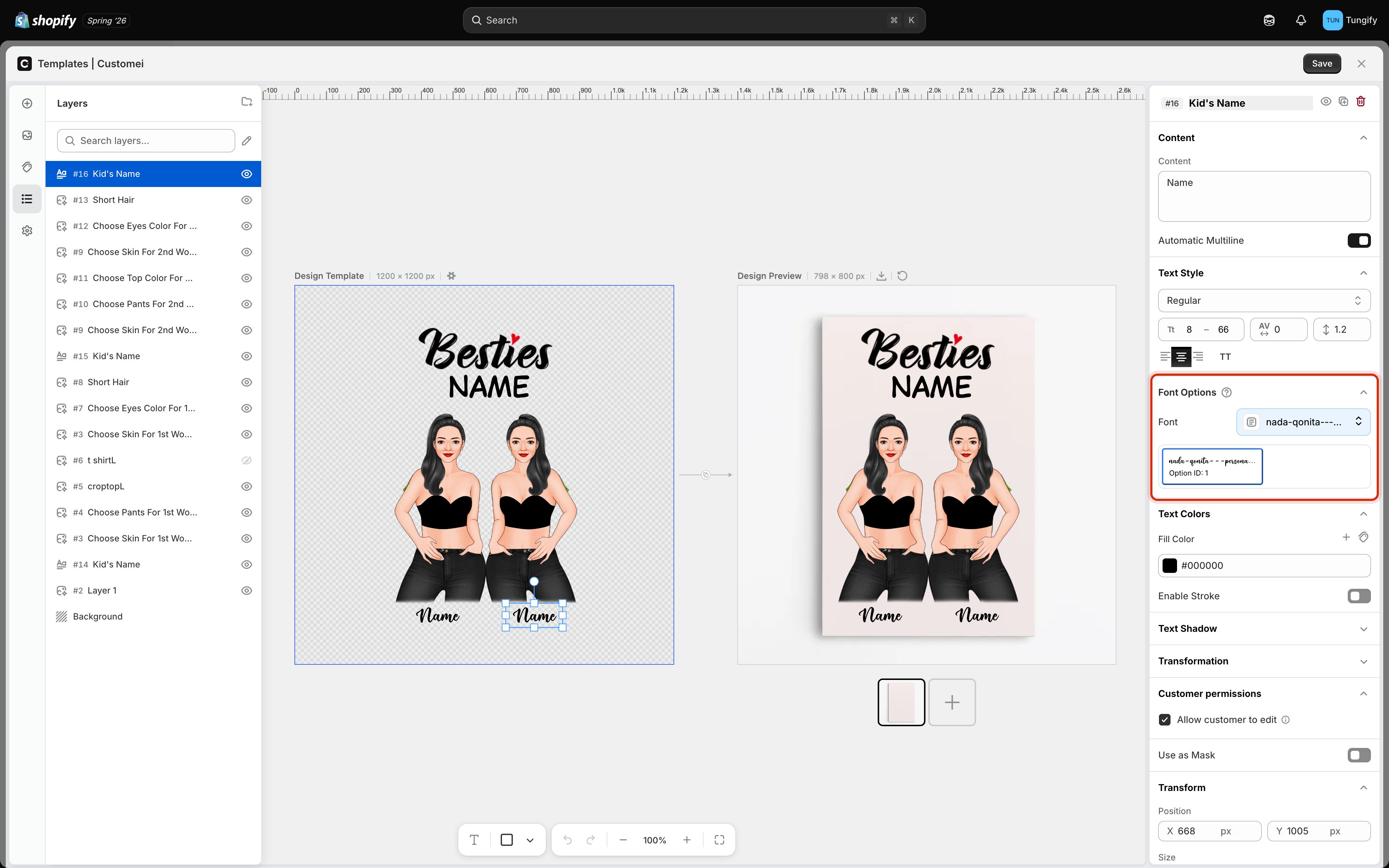
Font Options on a text layer, with a font library attached below the picker.
Setting one font
Click the Font picker and choose a typeface. The text on the canvas updates straight away, so you can try a few and keep the one that suits the design. That is all most layers need. A slogan, a fixed date, a shop name: you pick the font, every order gets it.Letting customers choose the font
Sometimes the font is part of the personalization. A customer ordering an engraved necklace may want their name in a script, while the next customer wants a clean block letter. To offer a choice, attach a font library to the layer. A library is a named set of fonts you have gathered in your Assets. Once attached, the fonts in it appear underneath the picker, each with an Option ID next to it.The Option ID is the number that connects a font to a customer’s choice. When you build the matching option in your option set, value
1 selects the font shown as Option ID 1, value 2 selects the second, and so on. See Connect an option set to a template.Which fonts you can use
You can build a library from Google’s font catalog, or upload your own font files if you have licensed a typeface for your products.Choosing fonts that survive personalization
A font that looks beautiful in your design can fail on a real order:- Test the awkward characters. Accented letters, apostrophes, and non-Latin alphabets are missing from a surprising number of decorative fonts. A missing character usually prints as a blank box.
- Watch very light and very thin fonts. What reads well on screen can disappear when it is embroidered or printed small.
- Try a long name. Condensed fonts hold up far better than wide ones when someone types fifteen letters.
Where to next
Text content and style
Size ranges, spacing, and alignment.
Text color and stroke
Fill color, outlines, and color libraries.
Connect an option set
Wire a customer’s choice to this layer.
What customers can change
Decide which layers a shopper can edit.