

Turning it on
Select a text layer, open Text Shadow, and switch on Enable Shadow. The shadow types and their controls appear underneath.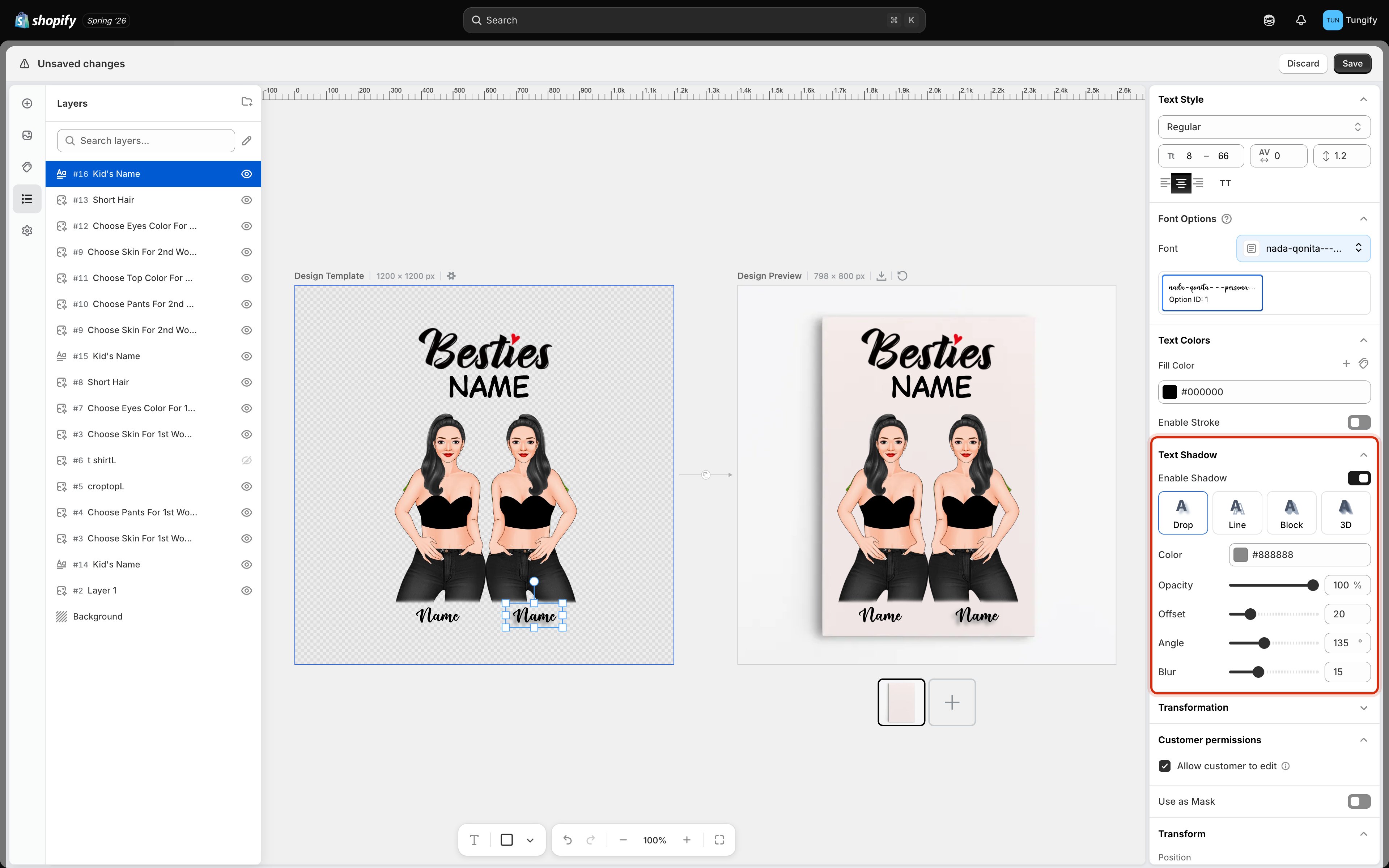
Text Shadow enabled, showing the four shadow types and the controls for the selected one.
The four shadow types
Click a type to switch. The controls below change with it, because a soft drop shadow needs a blur while a hard block shadow does not.
The controls
Getting a shadow that survives printing
The preview is generous. Ink is not.- Grey beats black. A mid grey shadow reads as depth. A pure black one reads as a printing fault.
- A little offset goes a long way. Large offsets look dramatic on screen and muddy at print size, because the shadow starts competing with the letters instead of supporting them.
- Blur is expensive on fabric. A soft gradient that looks smooth on a poster can band or speckle when printed on a t-shirt. On garments, Line or Block is often the safer choice.
Where to next
Text color and stroke
Fill color and outlines.
Curved and warped text
Arc, wave, circle, and other text shapes.
Text content and style
Size ranges, spacing, and alignment.
Preview settings
Make the design sit convincingly on the product.