

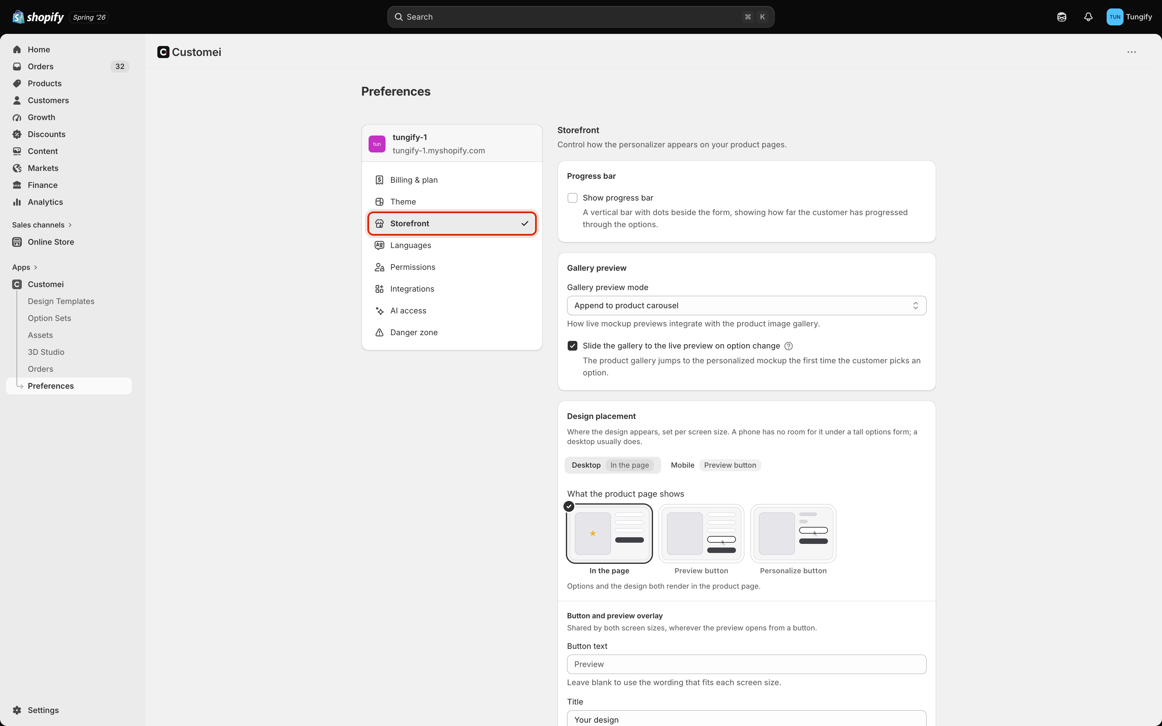
Preferences, Storefront. Every setting here applies to all of your products at once.
The one big choice: design placement
Design placement is the setting worth your time. Everything else on this page is small by comparison. You answer it twice, once for Desktop and once for Mobile, because the right answer is usually different on a phone. The grey label on each tab shows what that screen size is set to, so you never have to switch tabs just to check.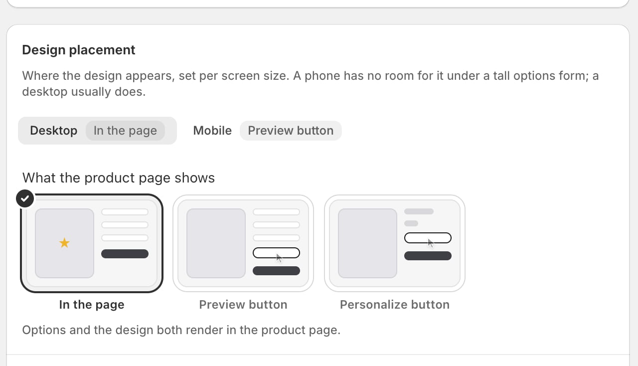
Design placement, Desktop. The three pictures are the three answers; the ticked one is what your customers get today.
The picture on each card is the product page at rest, before the customer touches anything. Hover a card and it plays what happens when the button is tapped.
On a phone
Pick Mobile and two extra settings appear, because a phone opens the design as a panel that slides up from the bottom.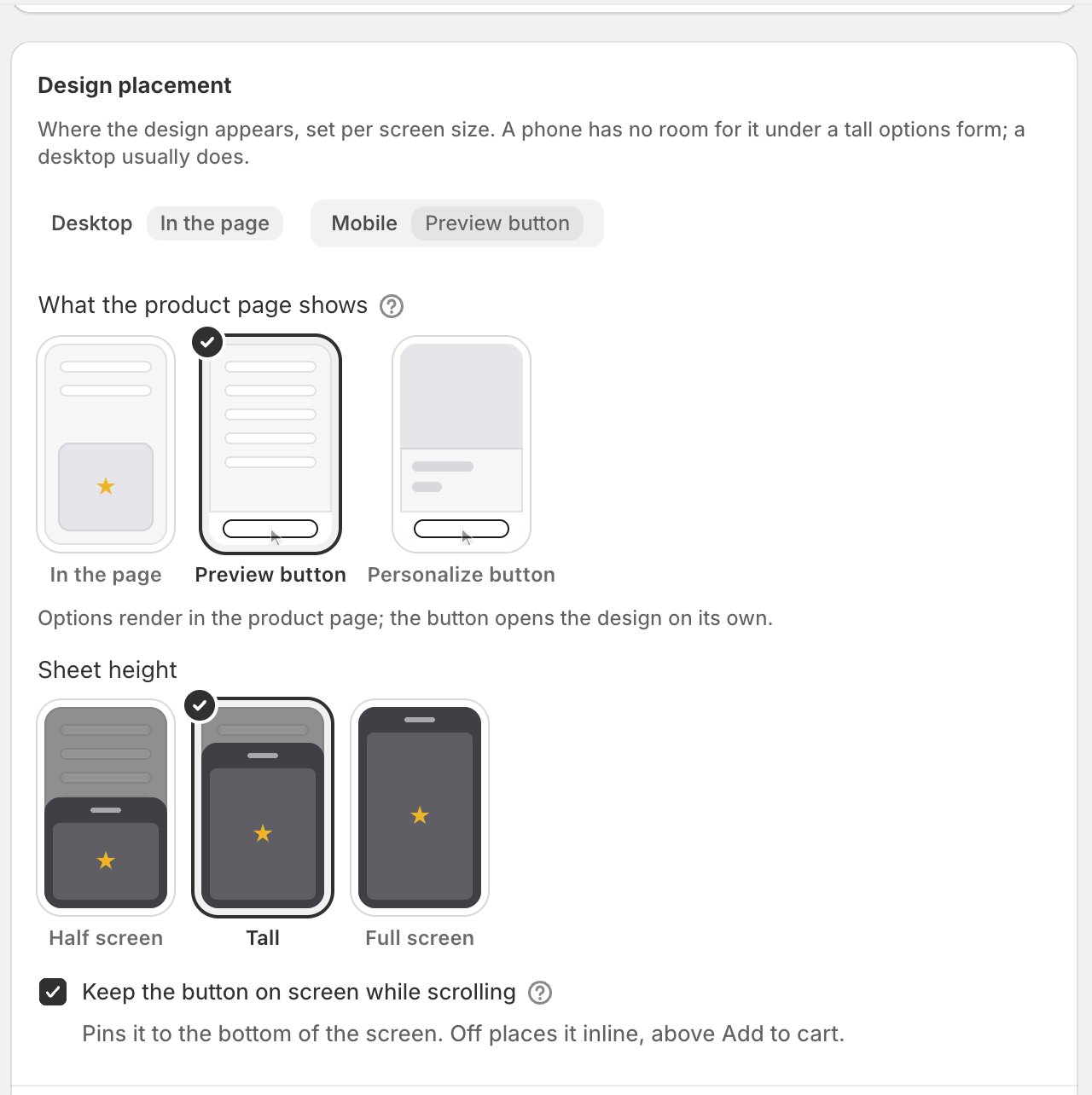
Design placement, Mobile. Sheet height decides how far the panel slides up.
- Sheet height is how far up the panel comes: Half screen, Tall, or Full screen. If the panel carries the questions too (that’s the Personalize button choice), give it more room.
- Keep the button on screen while scrolling pins the button to the bottom edge so it is always reachable. Turn it off and the button sits in the page instead, just above Add to cart.
On a desktop
Choose a button there and the design opens in a box in the middle of the screen. Modal size decides how big that box is: Medium, Large or Full screen. The pictures show it at each size, with your questions beside the design where the Personalize button choice puts them, so you can see how much room the design is really left.Wording the button and the panel
As soon as one of your two screen sizes uses a button, one more block appears. You write these once and both screen sizes use them.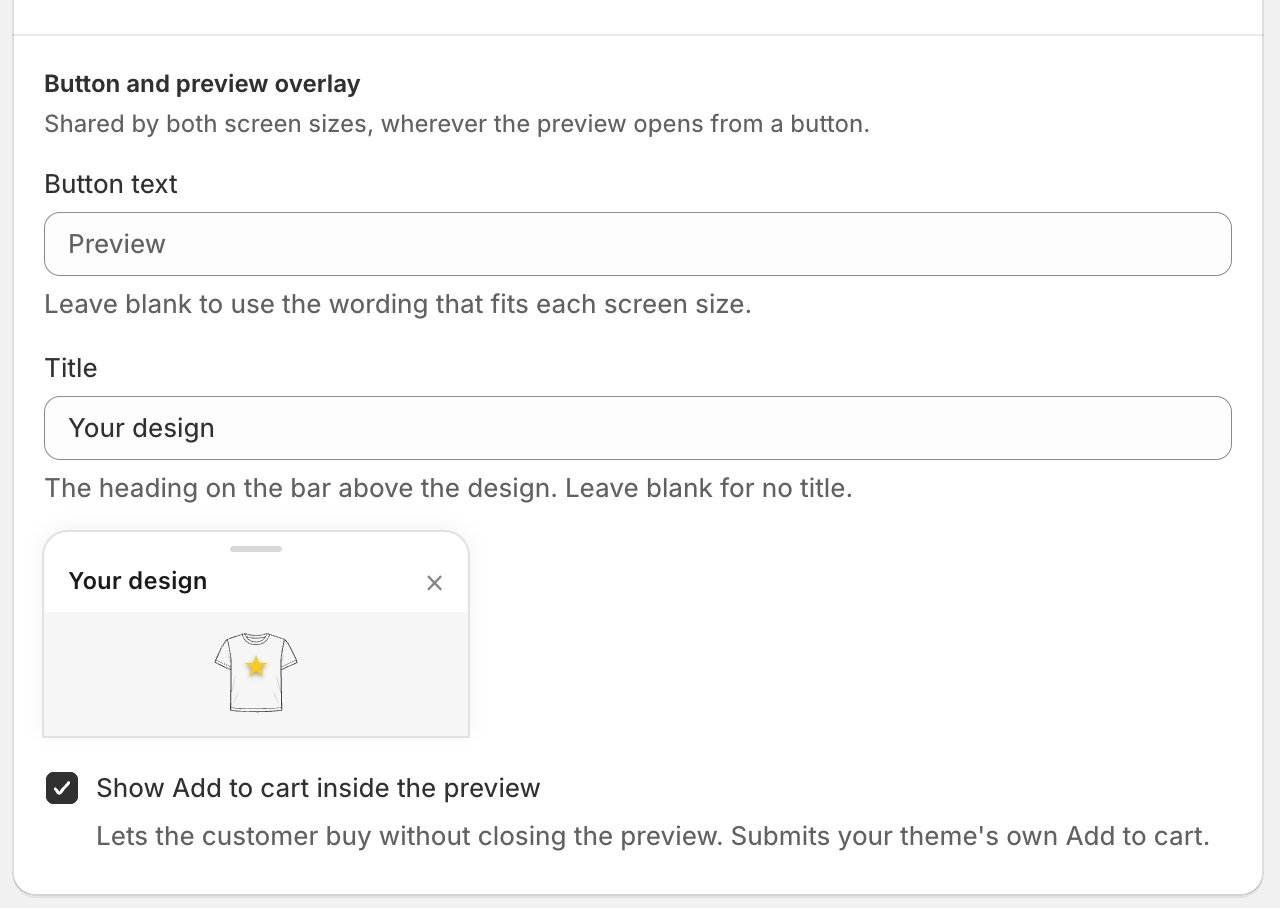
The button caption, the heading above the design, and whether Add to cart is repeated inside.
- Button text is what the button says. Leave it blank and each screen size uses the wording that fits: Preview where the button only opens the design, Personalize where it opens the questions too. Blank is the better answer unless you have your own phrase in mind.
- Title is the heading on the bar above the design. The little panel underneath shows your own words in place, so you can see if they fit. Leave it blank for no heading at all.
- Show Add to cart inside the preview repeats your own Add to cart button inside the panel, so a customer who is happy with what they see can buy without closing it first.
The picture in your product gallery
When you use mockups, Customei can put the customer’s own version into your product photo gallery. Gallery preview mode decides how:- Append to product carousel adds their version alongside your own photos. Your product shots stay.
- Replace with mockup carousel swaps your photos out for their versions while they are personalizing.
The progress bar
Show progress bar puts a thin bar with dots beside the questions, showing how far along the customer is. It helps on a long list of questions and looks odd on a short one, so it is off unless you turn it on.Saving
Change anything here and a bar appears at the top with Save and Cancel. Nothing takes effect until you save, and Cancel throws your changes away. Once you save, reload one of your product pages and you’ll see the new arrangement. There is nothing to publish for this.Where to next
Match the options to your store's look
Colours, sizes and spacing for the questions themselves.
Assign products and go live
Getting your options onto a product in the first place.